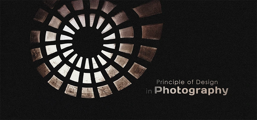
How to Use the 7 Principles of Art and Design in Photography
Cutout Partner
March 5, 2026
0 views
In today’s visually-driven world, creating striking and professional photographs requires more than just a good camera—it requires an understanding of composition and design. The seven principles of art and design—balance, rhythm, pattern, emphasis, contrast, unity, and movement—provide a roadmap for photographers to craft visually engaging images that capture attention and tell a story.
At Cutout Partner, a premium photo retouching agency, we help photographers and businesses elevate their images by combining expert editing with a deep understanding of visual aesthetics. By learning to apply these principles, you can not only enhance your photography skills but also ensure that every image you create is polished, professional, and visually compelling.
Whether you’re a professional photographer, an eCommerce store owner, or simply passionate about photography, understanding these principles will give you the tools to create photos that stand out and leave a lasting impression.
Applying the seven principles of art and design can instantly make your photographs more engaging and visually powerful. The good news is that you don’t need a formal art degree to understand or use these concepts effectively. With a simple introduction and a bit of practice, you can significantly improve your photography composition skills.
In this guide, we’ll explore the seven key principles of art and design, explain what each one means, and show you how to apply them in your photography. Think of this article as a beginner-friendly overview that will help you build a strong creative foundation while pointing you toward deeper learning opportunities.
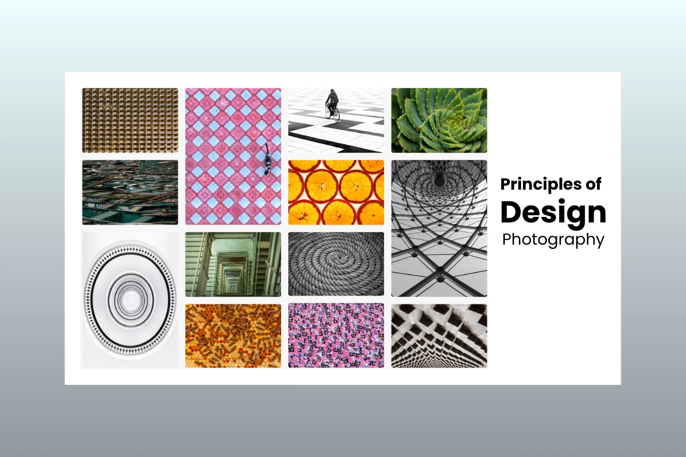
What Are the 7 Principles of Art and Design?
The seven principles of art and design are balance, rhythm, pattern, emphasis, contrast, unity, and movement. These core ideas help artists organize visual elements in a way that feels appealing, purposeful, and engaging to the viewer.
Artists rely on these principles—sometimes subtly and sometimes boldly—to make their work more visually compelling. While they are often associated with painting and graphic design, they are just as valuable in photography. By understanding and applying these principles, photographers can strengthen their visual storytelling and develop a more professional style.
Alongside the principles, there are also the elements of art and design. These include line, shape, form, space, value, color, and texture. Think of these elements as the basic tools or ingredients artists use to build an image. They form the foundation of all visual art, including photography.
When photographers combine these elements with the seven principles of design, they can create images that feel intentional, balanced, and visually powerful. Let’s take a closer look at each principle and how you can use it to improve your photography.
1. Balance

Balance refers to how the visual weight is distributed within a photograph. It helps determine whether an image feels stable and harmonious or intentionally tense and dynamic. When used thoughtfully, balance can either unify your photo or create purposeful visual tension.
There are three main ways to achieve balance in photography:
Symmetry:
Both sides of the frame mirror each other or contain very similar subject matter. This creates a clean, orderly look that feels calm and pleasing to the eye.
Asymmetry:
Different elements balance the composition through contrast rather than duplication. For example, a heavily textured subject on one side of the frame can be balanced by a smoother, simpler area on the other side. This approach often feels more natural and visually interesting.
Radial Balance (Radial Symmetry):
Elements are arranged evenly around a central point, similar to the spokes of a bicycle wheel. This type of balance naturally draws the viewer’s eye toward the center of the image.
A well-balanced photo usually conveys stability and visual harmony. In contrast, an intentionally unbalanced image can create tension, drama, or a sense of movement. Both approaches are valid—the key is choosing what best supports your creative goal.
Balance is largely intuitive because it “feels” right or wrong when you look at an image. To strengthen your sense of balance, experiment by slightly shifting your camera position or changing your framing. You can also practice by photographing scenes with different textures, colors, and visual weights. Don’t be afraid to explore and test new compositions—the more you experiment, the stronger your compositional instincts will become.
2. Rhythm

In many ways, photographic composition works much like music. The concept of rhythm in photography is inspired by music theory, where patterns and repetition guide how we experience a piece.
Just as musical notes create a flow that listeners follow, visual elements in a photograph guide the viewer’s eye through the frame. Rhythm refers to the repeated or organized arrangement of subjects and shapes within an image. This repetition can feel structured and calm or irregular and energetic, depending on how it is used.
When rhythm is used effectively, it creates a visual beat that naturally moves the viewer’s attention from one part of the photo to another. Repeating lines, shapes, colors, or textures are common ways to build rhythm in photography.
A helpful exercise is to imagine your scene as if it were musical notation. Notice how negative space, spacing between subjects, and visual relationships act like pauses and beats in music. The distance and variation between elements can create either a smooth, predictable flow or a more dynamic, unexpected visual rhythm.
To practice, look for repeating patterns in everyday scenes—such as rows of windows, street lights, waves, or footsteps—and experiment with framing them in different ways to strengthen the rhythmic feel of your images.
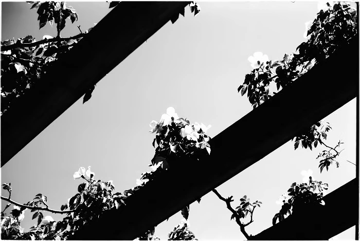
3. Patterns
Patterns help us make sense of the visual world through repetition and regularity. You can find them almost everywhere—from man-made structures and abstract designs to natural subjects like leaves, waves, and petals.
The human eye is naturally drawn to patterns, which is why they often create strong visual interest and even emotional responses in viewers. When used well in photography, patterns can make an image feel more organized, dynamic, and visually satisfying.
In simple terms, a pattern forms when elements of art and design—such as shapes, lines, colors, or textures—repeat in a predictable way within the frame. These repeating elements work together to create unity and rhythm in a photograph.
Patterns are considered an active principle of art and design because they add energy and depth, helping an image stand out. Learning to use patterns effectively is not just about camera technique—it is also about observation and curiosity.
To practice, start looking for repeating details in your surroundings. Architectural features like windows, tiles, staircases, and railings are excellent subjects. Organic subjects such as flowers, leaves, ripples in water, and sand dunes also offer beautiful natural patterns. Once you train your eye, you will begin to notice patterns almost everywhere you look.
4. Emphasis

Emphasis defines the main point of interest in a photograph. It directs the viewer’s attention to the most important part of the image. Elements such as color, space, texture, and line work together to establish this visual focus.
There are several effective ways to create emphasis in photography.
Spatial emphasis relates to where a subject is positioned within the frame. A single subject placed prominently—especially near the center or along strong compositional lines—naturally attracts attention because the viewer’s eye goes there first.
Selective grouping is useful when your scene contains multiple subjects. By arranging or framing elements carefully, you can guide the viewer’s eye toward the primary focal point while supporting details remain secondary.
Subject size also plays a powerful role in emphasis. Larger subjects tend to feel closer and more dominant, immediately drawing attention. Smaller elements placed in the background appear less important. Using size differences effectively helps communicate scale, depth, and spatial relationships within your photo.
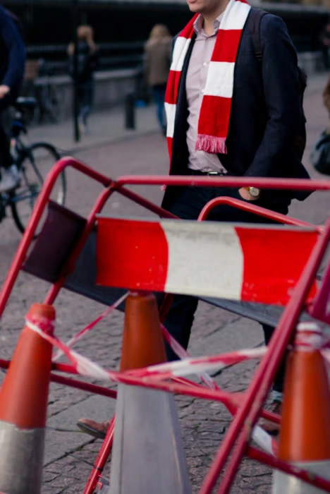
Color contrast is another strong tool for emphasis. A bright, bold subject set against a darker or more neutral background instantly stands out. This technique adds energy and visual impact while clearly guiding the viewer to the intended focal area.
When used thoughtfully, emphasis ensures your audience knows exactly where to look first, making your photographs more intentional and visually compelling.
Start Your Free Trial — Get 3 Images Edited FREE!
Ready to see the real power of professional photo editing? Now is the perfect time to experience the difference with Cutout Partner’s Free Photo Editing Trial. Whether you’re a photographer, eCommerce seller, studio manager, or marketing agency, high-quality images can dramatically improve customer trust, engagement, and sales.
Start Your Free Trial — Get 3 Images Edited FREE!
Start Your Free Trial — Get 3 Images Edited FREE!
5. Contrast
Contrast occurs when two or more opposing elements appear together in a photograph. It is one of the most powerful ways to create visual interest and draw attention. Classic examples include light versus dark and warm colors versus cool colors, but contrast goes far beyond brightness and color.
Physical qualities can also create strong contrast. Texture, for example, is an excellent way to add depth and tactile appeal to an image. When you place different textures together—such as something smooth beside something rough—you create a more engaging and immersive visual experience.
Imagine a smooth, round water droplet resting on the soft, fuzzy tendrils of a plant. The difference in surface quality immediately catches the eye and makes the image feel more vivid and real.
Contrast can also strengthen the story within your photo. Try experimenting with visual opposites such as:
- Sharp vs. soft
- Old vs. new
- Curved vs. straight
- Large vs. small
These juxtapositions add meaning and drama while helping important subjects stand out. When used thoughtfully, contrast not only improves clarity but also adds emotion and narrative depth to your photography.
6. Unity
Unity refers to how well the visual elements in a photograph work together. When unity is strong, the image feels cohesive, intentional, and pleasing to the eye. Every part of the frame supports the overall message rather than competing for attention.
Photographers can create unity by using similar colors, tones, themes, or repeating elements throughout the image. For example, a limited color palette or consistent lighting style can help tie different parts of a photo together, making the composition feel harmonious and complete.
The opposite of unity is disunity, which occurs when elements clash or feel disconnected. Common causes include poor cropping, awkward perspectives, inconsistent lighting, overexposure, or underexposure. These issues can distract viewers and weaken the overall impact of the image.
Another important factor behind unity is having a clear photographic outcome in mind. This means visualizing your final image before you press the shutter. When you pre-visualize the result, you gain a stronger sense of purpose and direction.
By planning your shot and understanding what you want to communicate, you can make more intentional choices about composition, lighting, and subject placement. This thoughtful approach gives you greater creative control and helps produce photographs that feel polished and unified.
7. Movement

In photography, the word movement often refers to motion blur or shutter speed. However, in art and design, movement means something different. It describes the visual path the viewer’s eye follows while looking at a photograph.
The elements and principles of art and design work together to shape this visual journey. With careful composition, a photographer can guide how viewers explore an image and which areas they notice first.
One of the most effective tools for creating movement is the use of lines. Lines act like visual highways that lead the eye through the frame.
- Jagged or diagonal lines create energy and excitement, quickly pulling the viewer’s gaze from one point to another.
- Curved lines feel smoother and more relaxed, slowing the viewing pace and creating a gentle visual flow.
Understanding how human vision works is key to controlling movement. Our eyes are naturally more sensitive to certain visual cues than others.
Color plays an important role here. Bright, saturated colors—especially red—tend to grab attention immediately. Softer tones, such as light blues or muted hues, feel calmer and draw the eye more subtly. By carefully choosing color and saturation, photographers can influence where viewers look and how quickly their eyes move through the frame.
There are many creative ways to guide the viewer’s gaze, from leading lines and repeating shapes to contrast and color placement. At its core, movement is about understanding visual psychology and using it intentionally to create photographs that feel dynamic, engaging, and easy to “read.”
Conclusion: Principles of Art and Design
The seven principles of art and design—balance, rhythm, pattern, emphasis, contrast, unity, and movement—form the foundation of all visual art, including photography. They guide how elements interact within a frame and help create images that are visually compelling and meaningful.
By understanding and applying these principles, photographers gain greater control over their compositions. This not only helps produce stronger, more striking photographs but also trains the eye to recognize visual opportunities in everyday scenes. With practice, these principles become intuitive tools, allowing you to capture images that are both aesthetically pleasing and emotionally engaging.
Most Asked FAQs: Principles of Art and Design in Photography
Here are the most common questions photographers and visual creators ask about applying the seven principles of art and design to photography:
- What are the seven principles of art and design in photography?
The seven principles are balance, rhythm, pattern, emphasis, contrast, unity, and movement. They guide how visual elements interact within a frame to create aesthetically pleasing and engaging images. - How does balance improve my photographs?
Balance distributes visual weight within a photo, making it feel stable and harmonious. It can be symmetrical, asymmetrical, or radial, depending on the desired effect. - What is rhythm in photography, and how do I use it?
Rhythm refers to the repetition or flow of visual elements that guide the viewer’s eye through the image. You can create rhythm by using repeating shapes, lines, or patterns and carefully arranging subjects within the frame. - How can patterns enhance my photos?
Patterns are repeated visual elements like shapes, textures, or colors. They add structure and visual interest, making images more engaging. Look for patterns in architecture, nature, or everyday scenes. - What techniques help create emphasis in a photo?
Emphasis highlights the main subject. You can use position, size, color, or selective focus to make certain areas of the photo stand out and guide the viewer’s attention. - How do I use contrast effectively in photography?
Contrast is created by opposing elements such as light vs. dark, soft vs. sharp, or old vs. new. It draws attention, adds depth, and makes subjects pop within the composition. - What is unity, and why is it important?
Unity ensures all elements in a photo work together cohesively. Use consistent colors, textures, and themes to create harmony, and plan your composition with a clear outcome in mind. - How can I create movement in my images?
Movement guides the viewer’s eye through a photo. Use lines, curves, shapes, and color to lead attention across the frame and control how viewers experience the image. - Can beginners use these principles in photography?
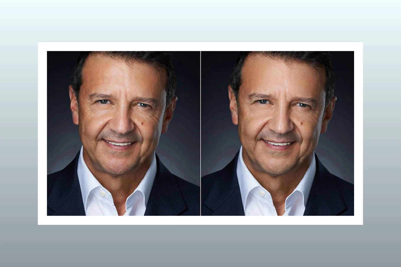
Absolutely. You don’t need an art degree—just practice observing your surroundings, experimenting with composition, and applying these principles consciously. - How does professional photo retouching fit with these principles?
Agencies like Cutout Partner enhance photos by refining elements like color, contrast, texture, and focus, ensuring that the principles of art and design are fully realized in every image for a polished, professional result.

Share this post
Ready to transform your images?
Elevate your brand with stunning, high-impact visuals. We’ll refine your photos to leave a lasting impression!
Get Started Now!