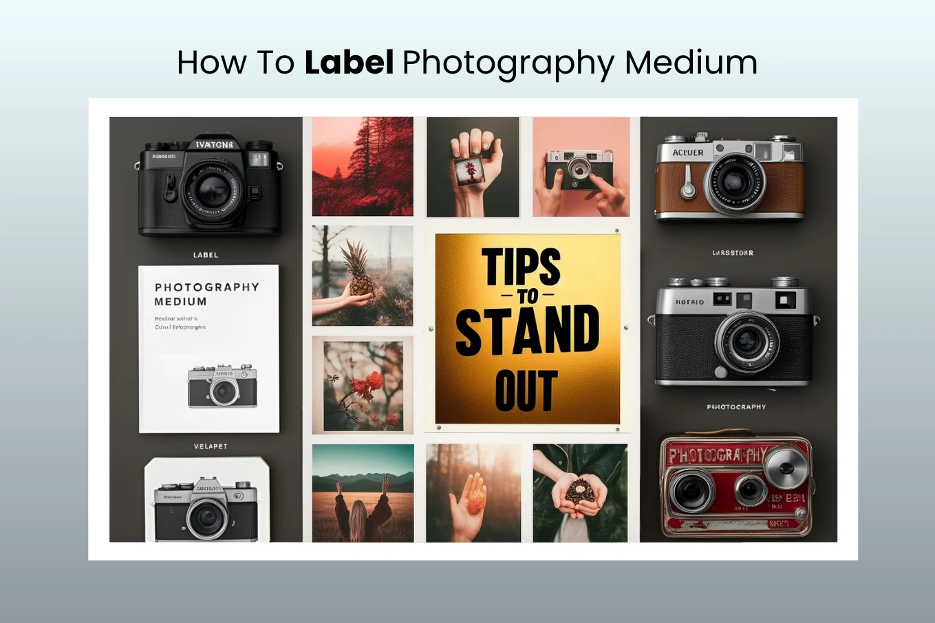
How To Label Photography Medium for Exhibitions? A Complete Guide
Cutout Partner
April 15, 2026
82 views
What if I told you that the way you label your photography can strongly influence how people see your exhibition? It really can. A label is not just a simple name. It helps connect your photo with the viewer and adds meaning beyond what they see in the image. So, how do you create a label that truly represents your work and grabs attention? In this guide, you’ll learn how to properly label your photography for exhibitions, along with simple tips and best practices to help your work stand out and feel more professional.
Why Labeling Important in Photography
Labeling might seem like a small step in your workflow, but it plays a crucial role in keeping your photography organized, efficient, and professional. Whether you’re working with film rolls, memory cards, or printed images, proper labeling ensures that nothing gets lost, mixed up, or misunderstood.
Keep Track of Formats and Mediums
Photography often involves multiple formats and mediums—film types, ISO variations, or different storage devices. By labeling everything clearly, you instantly know what you’re working with. No more guessing which roll is ISO 400 or which memory card contains a specific shoot. It saves time and prevents costly mistakes.
Streamline Digital Asset Management
Good labeling doesn’t stop at physical items—it directly supports your digital workflow. When your memory cards, hard drives, or folders are clearly labeled, it becomes much easier to organize, locate, and match your digital files with corresponding projects. This is especially helpful when handling large volumes of client work or long-term projects.
Present Work Professionally
First impressions matter, especially in photography. A neatly labeled print, envelope, or package shows attention to detail and professionalism. Clients and galleries notice these small touches, and they can significantly enhance how your work is perceived. A simple label can elevate your presentation from casual to polished and trustworthy.
Why Labeling Matters in Exhibitions
Labels in exhibitions do much more than just name a photograph. They help viewers understand the deeper meaning behind the image and connect with the photographer’s idea.
A good label gives important details that guide the viewer. It can explain when, where, why, and how the photo was taken. This extra information helps people see the story behind the image, not just the visual.For photographers, labels are like their voice in the exhibition. It’s a way to share thoughts, ideas, and the inspiration behind the work.
In simple terms, labels add depth to the experience. Instead of just looking at a photo, viewers can better understand it and feel more connected to the story it tells.
Key Decisions for Labeling Photographs: A Complete Guide for Exhibitions
Labeling photographs in an exhibition is not just about adding names and details, but about creating a clear connection between the artwork and the viewer through thoughtful presentation and well-structured information. When labels are carefully designed and placed, they enhance the overall experience and help audiences better understand the story, technique, and intention behind each image.
This guide explains everything you need to know about choosing the right labeling method, writing effective label content, and maintaining a professional presentation that complements your photography.
Choosing the Right Labeling Method with Printing Label
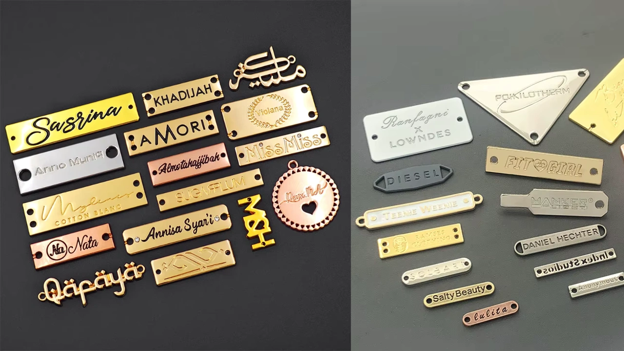
Acrylic Sign Holders
Acrylic sign holders are widely used in modern and contemporary exhibitions because they offer a clean, elegant, and professional appearance that blends seamlessly into gallery environments. Their transparent surface allows the photograph to remain the primary focus while still presenting important label information in a subtle and organized way.
This type of labeling works especially well for minimalist or commercial-style photography where a polished and refined presentation is important. Acrylic also tends to be durable and long-lasting, making it suitable for exhibitions that run for extended periods.
However, acrylic is not always the perfect solution for every exhibition. In some cases, it can create a slightly sterile or overly polished look that may not match more emotional, artistic, or organic photography styles. Lighting can also become an issue because acrylic surfaces may reflect spotlights and create glare, which can make the text difficult to read. Additionally, images placed behind acrylic may sometimes appear slightly washed out depending on the display setup.
Printed Labels
Printed labels are a classic and highly flexible option that works well for a wide range of exhibition styles. They allow complete control over design elements such as size, layout, typography, and color, making it easier to match the labels with the overall theme of the exhibition.
This method is especially useful for photographers who want a more traditional or artistic presentation, as printed labels naturally complement fine art photography and documentary-style work. By using high-quality, acid-free paper and archival ink, printed labels can remain durable and visually appealing for long periods without fading or discoloration.
Although printed labels may not have the sleek appearance of acrylic holders, they offer a warmer and more personalized look that many exhibitions benefit from. They are also easier to produce, replace, and update when changes are needed.
Tips for Choosing Between Acrylic and Printed Labels
Selecting the right labeling method depends on both visual preference and practical considerations, and making the right choice can significantly improve the presentation of your exhibition.
When label size is important, printed labels provide greater flexibility because they can be easily adjusted to larger or custom dimensions without design limitations. If your exhibition uses strong lighting or spotlights, it is important to consider glare, as acrylic surfaces can reflect light and reduce readability in certain conditions.
Budget is another key factor, especially for large exhibitions, since printed labels tend to be more cost-effective when produced in higher quantities. Durability should also be considered because acrylic labels generally last longer, while printed labels may require replacement over time depending on handling and environmental conditions.
Aesthetic compatibility is equally important, as modern and commercial photography often pairs well with acrylic, while traditional or artistic photography is usually better suited to printed labels. Finally, if you expect to update or change information during the exhibition, printed labels offer a much easier and faster solution compared to acrylic displays.
Crafting Optimal Label Content
The content of a label plays a crucial role in how viewers understand and connect with a photograph, so it is important to present information in a clear, structured, and engaging way.
Include Key Details
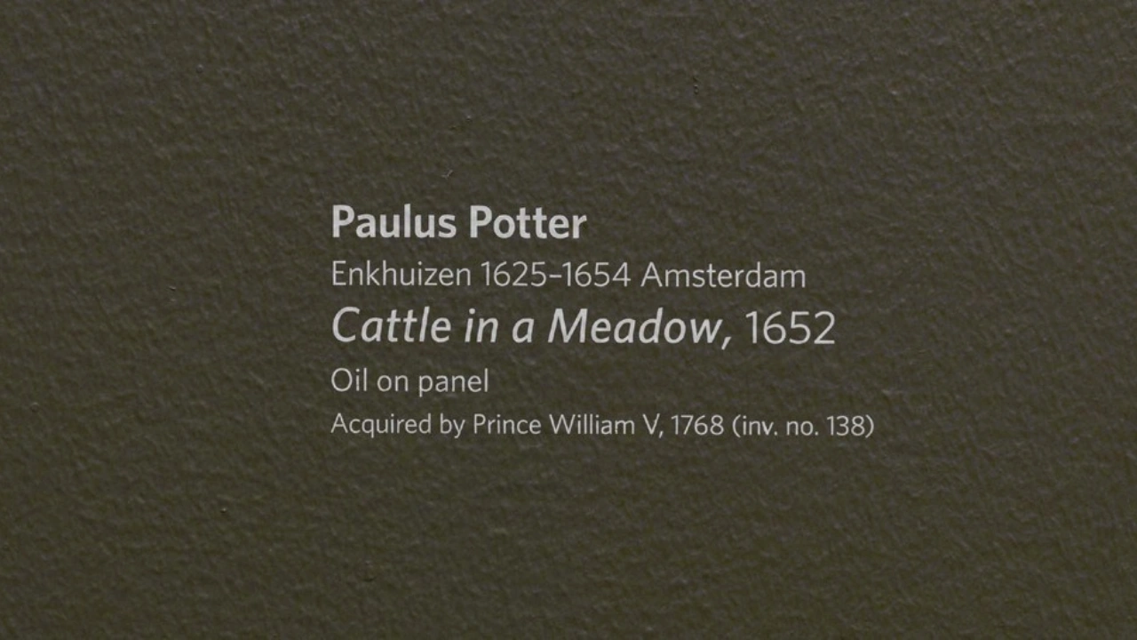
Every exhibition label should include essential information that provides context without overwhelming the viewer. This typically includes the artist’s full name, the title of the photograph, the date the image was created, the dimensions of the print, the photographic process used, and the edition number if the work is part of a limited series.
Omit Non-Essential Information
Labels should remain focused and informative, so it is best to avoid including unnecessary details such as personal background information or lengthy explanations about inspiration. Keeping the content concise ensures that viewers can quickly understand the artwork without distraction.
Keep Language Clear and Simple
Using simple and direct language helps make labels accessible to all viewers, regardless of their familiarity with photography. Avoid technical jargon or overly complex art terminology, and focus on writing sentences that are easy to read and understand.
Maintain a Consistent Structure
Consistency across all labels creates a more professional and organized exhibition. Present information in the same order for every photograph, such as artist name, title, date, medium, and dimensions, so viewers can easily follow and compare details throughout the exhibition.
Designing Labels for Readability and Impact
The design of a label is just as important as its content, as it directly affects how easily viewers can read and engage with the information.
Font size should be large enough to read comfortably from a distance, typically around 20-point or higher depending on the display setting. Clean and simple fonts such as sans serif styles help improve readability and maintain a modern appearance.
Spacing is also important, as adequate white space around text prevents visual clutter and makes the label easier to scan quickly. Keeping line lengths short and avoiding dense paragraphs ensures that viewers can absorb information without effort.
Creating High-Quality Physical Labels
For a professional exhibition, physical labels should be produced using materials that ensure durability and long-term quality. Acid-free paper helps prevent yellowing and deterioration over time, while archival ink minimizes fading and keeps text sharp and clear.
Choosing the right scale is essential, as labels should be readable from a reasonable viewing distance without overpowering the photograph. Maintaining visual consistency in fonts, colors, and layout across all labels helps create a cohesive and polished presentation.
Properly Attaching Labels
Attaching labels requires careful handling to avoid damaging both the label and the photograph. It is best to use archival-quality adhesives or tape and apply them gently to prevent wrinkles or bubbles. Whenever possible, labels should be attached to the frame rather than directly onto the photograph to avoid permanent damage.
For heavier materials such as acrylic or wood, stronger mounting solutions like double-sided tape, small screws, or Velcro may be required to ensure stability while still allowing for easy removal when needed. Direct contact between adhesives and photographs should always be avoided to prevent residue or tearing.
Protecting Labels for Long-Term Use
To maintain the quality of exhibition labels, proper care and storage are essential. Keeping labels and photographs away from direct sunlight helps prevent fading, while maintaining a cool and dry environment reduces the risk of damage caused by humidity.
Cleaning should be done carefully and only when necessary, using appropriate archival methods to avoid scratches or wear. Gentle handling during installation and removal also helps preserve the condition of both labels and prints over time.
Using Digital Labels for Modern Exhibitions
Digital labeling solutions are becoming increasingly popular in modern exhibitions because they offer flexibility and interactivity. Tools such as design software, QR codes, and digital displays like tablets or screens allow viewers to access additional information without overcrowding the physical label.
One of the biggest advantages of digital labels is the ability to update content بسهولة without reprinting, which saves both time and cost while keeping information accurate and up to date.
Best Practices for Label Design
Well-designed labels enhance the overall exhibition experience by making information clear, attractive, and easy to access. Readability should always be the top priority, using simple fonts, appropriate sizes, and high-contrast colors that are easy to scan.
Consistency in layout and structure ensures that all labels feel connected and professional, while branding elements such as logos, colors, and typography help reinforce the identity of the exhibition. Proper use of white space keeps the design clean and allows the photography to remain the main focus.
Mistakes to Avoid When Labeling Photography Items
Labeling plays an important role in presenting photography professionally, but small mistakes can reduce clarity, damage materials, or create confusion for viewers. Understanding what to avoid will help you maintain a clean, consistent, and high-quality labeling system that supports your exhibition or workflow.
Using Ink-Based Labels That Smear
One common mistake is relying on inkjet or ink-based labels that can easily smear, fade, or lose clarity over time, especially when exposed to moisture, heat, or frequent handling. This can make important information difficult to read and reduce the overall professional appearance of your labels.
For better durability and long-term use, thermal printing is often a more reliable choice because it produces sharp, smudge-resistant text that remains clear even in challenging conditions. This is particularly useful for exhibitions, storage systems, or shipping processes where labels need to stay intact and readable.
Over-Labeling or Mislabeling
Adding too much information to a label can overwhelm viewers and make it harder to understand the key details. Labels should be simple, structured, and focused only on the most important information related to the photograph.
Mislabeling is another issue that can create confusion and reduce credibility, especially in exhibitions or professional portfolios. Using inconsistent formats, incorrect dates, or mismatched titles can distract viewers and make the presentation feel unorganized.
To avoid this, it is important to follow a standard labeling format across all items, ensuring that every label presents information in the same order and style. This consistency improves readability and creates a more polished and professional look.
Ignoring Label Compatibility
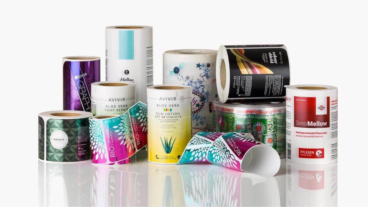
Using labels that are not compatible with your printer can lead to poor print quality, alignment issues, or even damage to your equipment. Labels may not stick properly, print clearly, or fit the intended layout, which can affect both appearance and usability.
It is always best to choose label types and sizes that are specifically designed for your printer model. For example, if you are using a dedicated labeling device like the NIIMBOT B21Pro, selecting compatible labels ensures smooth operation, better print results, and long-term reliability.
Final Thoughts
Effective labeling is an essential part of any photography exhibition because it adds meaning, context, and clarity to each image. Choosing the right materials, presenting only the most relevant information, and maintaining a consistent and readable design all contribute to a more engaging and professional display.
When labels are thoughtfully created and carefully placed, they do more than identify a photograph, as they help communicate the story, technique, and vision behind the work while creating a stronger connection between the photographer and the audience.
Share this post


Ready to transform your images?
Elevate your brand with stunning, high-impact visuals. We’ll refine your photos to leave a lasting impression!
Get Started Now!