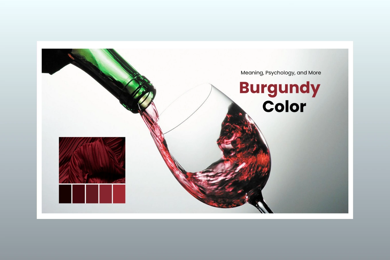
Burgundy Color Meaning, Psychology, and More in 2026 (Updated)
Cutout Partner
January 6, 2026
0 views
Close your eyes and picture the richness of a dark red wine moving gently inside a clear crystal glass.That feeling captures burgundy — a lavish, refined shade of red touched with subtle notes of purple and brown.Burgundy represents depth, polish, and sophistication, giving it strong influence in design, fashion, and visual identity.
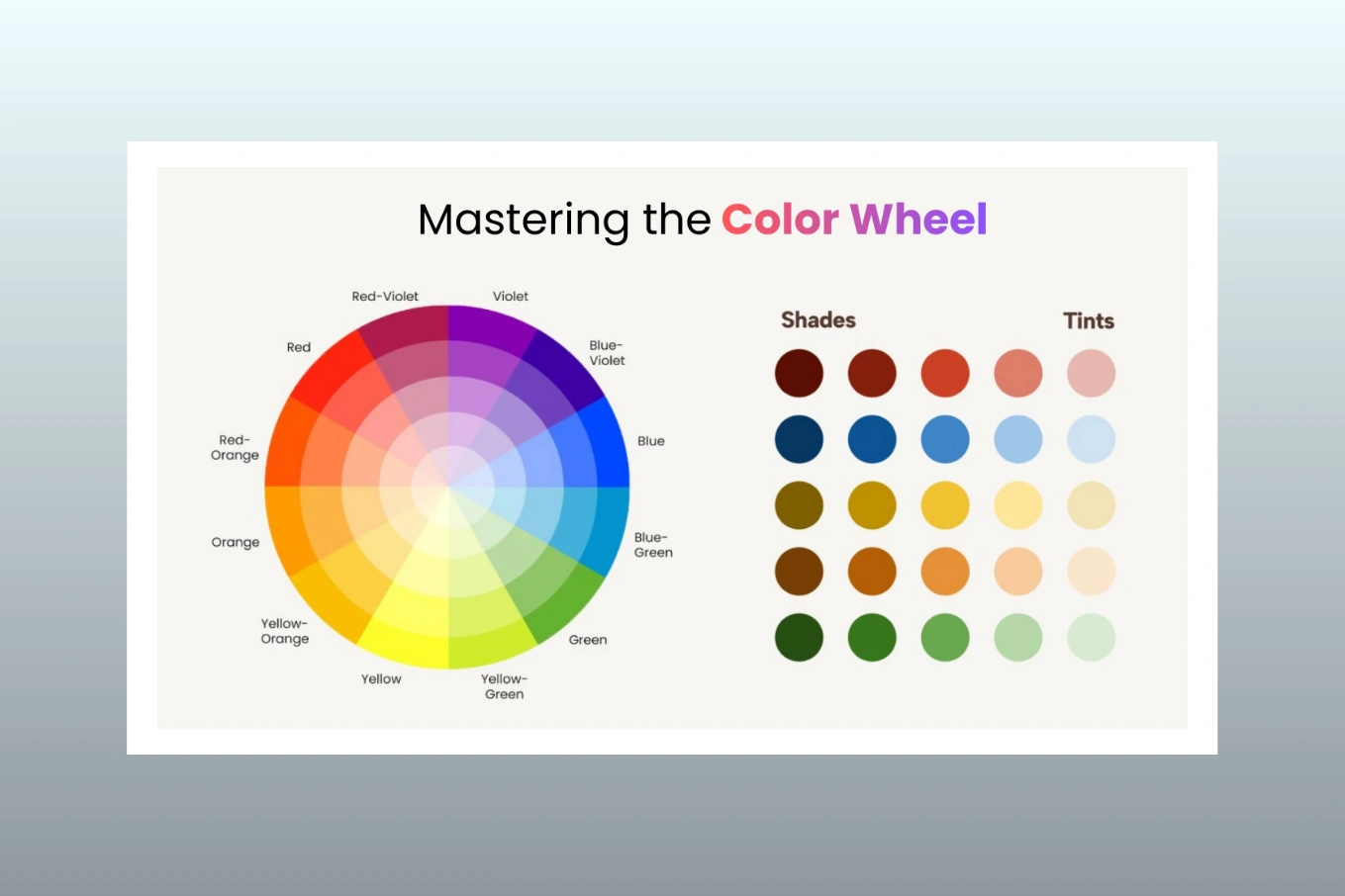
On the color wheel, burgundy color is a deeper variation of red. It conveys passion, determination, and bold ambition.Its warm undertones add comfort and approachability, while the darker value expresses authority and seriousness.

Commonly linked to luxury, opulence, and high status, burgundy stands out effortlessly while still maintaining understated elegance.You’ll find burgundy shaping everything from interior styling and fashion collections to brand aesthetics, catalogue layouts, and product packaging.
This Design Journal feature breaks down the symbolism of the burgundy color, its psychological effects, and how it can be used effectively in branding, marketing, and creative work.By the end, you’ll see why this enduring hue continues to draw people in and remain relevant across generations.
Burgundy Color Psychology

Burgundy is a color closely tied to emotion, often expressing power, elegance, and ambition. Its deep, rich shade gives off a feeling of seriousness, authority, and professionalism.Because it’s rooted in red, it carries the energy of passion and desire, while the subtle purple tones introduce an element of mystery and creativity.
Psychologically, burgundy engages the mind, inspiring thoughtful reflection and deeper contemplation.Its links to luxury, achievement, and sophistication make it a popular choice for upscale branding and premium products.
The color can also bring a sense of warmth and comfort, much like enjoying a fine glass of wine beside a glowing fire.For many people, wearing or being surrounded by burgundy can boost confidence, self-belief, and a quiet sense of power.It’s often viewed as a color of discipline and steady ambition, which is why it works well in spaces where focus and introspection are important.
The Cultural Significance of the Burgundy Color with Brand Identify

Burgundy is a color closely tied to emotion, often expressing power, elegance, and ambition. Its deep, rich shade gives off a feeling of seriousness, authority, and professionalism. Because it’s rooted in red, it carries the energy of passion and desire, while the subtle purple tones introduce an element of mystery and creativity. Psychologically, burgundy engages the mind, inspiring thoughtful reflection and deeper contemplation.Its links to luxury, achievement, and sophistication make it a popular choice for upscale branding and premium products.
The color can also bring a sense of warmth and comfort, much like enjoying a fine glass of wine beside a glowing fire.For many people, wearing or being surrounded by burgundy can boost confidence, self-belief, and a quiet sense of power.It’s often viewed as a color of discipline and steady ambition, which is why it works well in spaces where focus and introspection are important.
Why Brands Use Burgundy: Meaning and Marketing Value

Burgundy is a top choice for luxury brands, premium products, and industries that want to showcase elegance, authority, and exclusivity.Across fashion labels and automotive companies, this rich shade immediately communicates a sense of prestige.In the wine, food, and hospitality sectors, burgundy often appears in logos and packaging to create feelings of warmth, richness, and indulgence.High-end car manufacturers also use burgundy interiors to elevate the luxury experience.In marketing, this color represents quality, reliability, and sophistication.
It appeals to audiences with refined taste who value exclusivity, making it a perfect match for upscale services and boutique products.
Understanding the Key Associations of Burgundy Color

Luxury and Wealth — Burgundy is closely linked to luxury, sophistication, and richness. This is clear in high-end fashion, premium packaging, and upscale branding. Its deep, rich tone gives a sense of affluence, making it a favorite for luxury items such as jewelry, cosmetics, and high-end lifestyle products.
Power and Authority — Burgundy conveys quiet strength, leadership, and ambition. Unlike brighter reds, its deeper shade represents composed and refined power. It is often chosen by businesses that want to show authority and influence, including legal firms, financial institutions, and corporate brands.
Passion and Desire — Combining the energy of red with the depth of brown, burgundy evokes strong emotions, passion, and desire. It is linked to love and intimacy, making it a popular choice for romantic branding, intimate settings, and messaging that inspires deep emotional connections.
Elegance and Refinement — Burgundy stands for elegance, sophistication, and timeless style. It reflects maturity and high taste, often appearing in formal events, classic fashion, and luxury interiors. Its classic shade never goes out of style, always giving a sense of class and grace.
Warmth and Comfort — Burgundy also creates a feeling of coziness and warmth, especially in interior design and seasonal themes. It is widely used in home decor during fall and winter to make spaces inviting, comforting, and welcoming.
Historical Meanings and Traditions Behind Burgundy Color

Royal Distinction and Power — Throughout history, burgundy has represented distinction and authority. During the Renaissance, it was a color reserved for royalty, nobles, and the upper class. The dyes used to create this rich shade were rare and costly, which strengthened its connection to wealth, prestige, and influence.
Theatrical Elegance — In the 19th and 20th centuries, burgundy continued to symbolize elegance and grandeur. It became a key color in the design of theaters, fine dining restaurants, and luxury cars. Velvet burgundy curtains, plush seating, and other interior touches created a rich, immersive experience, making it synonymous with high-class environments.
Modern Luxury — Today, burgundy remains a favorite in high-end fashion, premium branding, and luxury packaging. Designers, perfumeries, and lifestyle brands rely on it to convey opulence and exclusivity. Its timeless elegance ensures it fits perfectly in both classic and contemporary design styles.
How Burgundy Color Influences User Experience

Authority and Trust — Burgundy is strongly linked to authority and trust, making it a powerful choice for UI/UX design in finance, law, and high-end e-commerce platforms. Its deep, confident tone communicates seriousness and reliability, which is why legal firms, financial institutions, and premium subscription services often use it.
Warm Engagement — Unlike bright red, burgundy has a warm, inviting feel. It naturally draws attention without being harsh, improving user engagement. Burgundy call-to-action (CTA) buttons, banners, and product highlights create a sense of exclusivity, encouraging users to interact and take action.
Premium Experience — Incorporating burgundy in a user interface signals a premium, high-end experience. Luxury e-commerce sites and membership-based platforms often use it to stand out from mainstream offerings. The color also gives subscription services a “members-only” feel, reinforcing exclusivity and sophistication.
Famous Examples of Burgundy Color in Branding with Wine

Luxury Fashion Brands — Iconic fashion houses like Gucci and Louis Vuitton often use burgundy in their products, packaging, and marketing. Its luxurious feel makes it a perfect match for high-end fashion, instantly communicating elegance and sophistication.
Wine Labels and Gourmet Packaging — Burgundy, named after the famous French wine, is widely used for wine labels and gourmet food packaging. The color highlights richness, quality, and the premium nature of the product, making it appealing to discerning customers.
Interior Design — Burgundy is a classic choice in interior design, especially in libraries, lounges, and upscale hotels. Velvet furniture, drapes, and carpets in burgundy create a refined, cozy, and inviting atmosphere.
Media and Entertainment — Theaters and opera houses often feature burgundy curtains, seating, and decor to convey elegance, intimacy, and grandeur. This timeless use of the color continues to inspire modern design in cultural and entertainment spaces.
When to use burgundy color?
Luxury Branding — Burgundy is ideal for branding luxury products and premium services. Its association with wealth, sophistication, and authority makes it a top choice for high-end fashion, cosmetics, and upscale hospitality.
Seasonal Design — With its warm tones, burgundy is a favorite for autumn and winter collections. Brands launching seasonal products, fashion lines, or holiday campaigns often use burgundy to capture the cozy, inviting feeling of these seasons.
Formal Events — Burgundy’s timeless elegance makes it perfect for formal invitations, wedding decor, and upscale event branding. It adds a touch of sophistication and classic beauty to any event design.
Food & Beverage — Burgundy communicates richness, flavor, and premium quality in gourmet products, wine labels, and beverages. It is frequently used on wine bottles, chocolate packaging, and other high-end food products.
UI/UX Design — In digital platforms, burgundy conveys authority, trust, and a sense of luxury. It is often featured in financial services apps, subscription platforms, and membership portals to create an exclusive, premium user experience.
Burgundy Color Combinations
Gold – Represents luxury, grandeur, and wealth. Burgundy paired with gold is a classic choice for regal branding, premium packaging, and elegant event decor.Navy Blue – Symbolizes authority and sophistication. This combination is often seen in corporate branding, high-end interiors, and refined fashion designs.
Blush Pink – Brings warmth, romance, and intimacy. Burgundy with blush pink is popular in wedding decor, feminine branding, and romantic-themed projects.
Emerald Green – Stands for opulence and natural beauty. The strong contrast between burgundy and emerald green creates a bold, striking look, perfect for upscale interiors, luxury fashion, and premium branding.
Beige and Cream – Reflect sophistication and subtlety. Pairing burgundy with beige or cream works beautifully in modern, minimalist designs for high-end fashion, cosmetics, and interior design.
Color Variations of Burgundy

- Maroon – A redder, less purple shade. Maroon represents strength, courage, and reliability. It is commonly used in school uniforms, sports branding, and traditional designs.
- Wine – A deep, rich red similar to red wine. Wine evokes depth, luxury, and classic appeal, making it ideal for high-end lifestyle products and premium branding.
- Plum – A more purple-toned shade, adding creativity and mystery. Plum is often used in beauty products and fashion, where it symbolizes elegance and intrigue.
- Oxblood – A darker, intense red with brown undertones. Oxblood conveys power, stability, and boldness, and is frequently seen in leather goods, fashion, and luxury automotive interiors.
Explore the relevant resource on Colors
- Lilac Color Updated Guide: Meaning, Codes & Design Uses
Fun Facts About Burgundy Color Meaning
- The color gets its name from Burgundy wine produced in France.
- In film and television, burgundy often represents wealth and nobility.
- The term “Burgundy Red” is sometimes used to describe this specific shade.
- Its warmth and elegance make it a popular choice for autumn and winter weddings.
- Historically, European nobility wore burgundy to signify wealth and status.
- The dye for burgundy was once made from natural sources, like plants and insects.
- Burgundy is strongly associated with the fall season because of its rich, warm tone.
- The color is frequently used in theaters and opera houses to create a sense of grandeur.
- In fashion, burgundy is considered timeless, never going out of style.
- Burgundy is a staple in holiday decor, especially at Christmas, symbolizing warmth and celebration
You might also read these helpful resources:
- How to Choose the Best Camera for Photography
- How to Choose the Best Photo Retouching Company
- Best 3 Point Slinger For Camera On Professionals
- Top 25 Sitting Poses Every Photographers Can Try
Rounding Up : Embracing Burgundy in Your Design
Burgundy is more than just a deep shade of red — it represents power, luxury, and sophistication.Its psychological influence makes it a strong choice for branding, while its versatility allows it to enhance fashion, interior design, and user experiences.By understanding the meaning, psychology, and cultural significance of burgundy, you can use it to elevate your designs, build trust, and convey elegance.Whether you’re launching a premium brand, decorating an elegant space, or creating an exclusive experience, burgundy will always stand for class and refinement.
Share this post
Ready to transform your images?
Elevate your brand with stunning, high-impact visuals. We’ll refine your photos to leave a lasting impression!
Get Started Now!