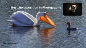
Juxtaposition is a technique where you place two different things side by side to show how they are not the same. The two subjects do not need to be complete opposites, but they should be clearly different from each other to create strong visual contrast.
Photographers have many tools they can use to make their images more interesting and powerful. They can use lighting and practical effects, include storytelling elements or characters, and apply different composition techniques to improve the final result.
Juxtaposition is one composition method that every photographer should learn and practice. It adds deeper meaning to photos and helps communicate ideas more clearly. This technique also makes it easier to tell a story within a single frame. By understanding and using juxtaposition, you can grow your skills and become a more creative and confident photographer.
The examples shared in this article will make the concept easier to understand. While the introduction explains the idea, the sample photos will clearly show what juxtaposition looks like and how you can apply it in your own photography work.
What Is Juxtaposition in Photography?
Juxtaposition in photography happens when two or more elements in a scene clearly contrast with each other. The difference between these elements often creates a theme or deeper message within the image. When viewers notice the contrast, they naturally begin to think about the relationship between the subjects.
Juxtaposition is more than simply placing two objects side by side. When elements are positioned close together, they affect how we understand each one. Their closeness gives them shared meaning. Because of this, the pairing should never feel accidental. It needs thoughtful consideration.
This does not mean that every image using juxtaposition must be carefully staged. You can plan and create a scene intentionally, but you can also discover natural juxtapositions in everyday life. Many powerful photographs come from observing how different elements interact in real-world environments.
To create effective juxtaposition, your photo should include at least two elements with strong visual weight. The viewer’s attention should move between them, comparing their roles and purpose within the frame. This comparison is what gives the image strength.
Juxtaposition is such a powerful compositional tool because it is built on comparison. When two opposite elements appear together, they can create strong contrast. This contrast may add tension, drama, or even humor. On the other hand, placing two similar elements together can create harmony and balance.
The key to successful juxtaposition is meaning. Random objects placed next to each other rarely create impact. But when you carefully choose elements that relate to each other in an interesting way, their comparison increases the importance of the image.
For example, imagine a tree standing beside a tall building. One represents nature, while the other represents human creation. This simple contrast invites viewers to think about the relationship between the natural world and urban development. It encourages questions and deeper interpretation.
Sometimes, juxtaposition depends on context. In these cases, the viewer needs enough background information to understand the comparison. When used correctly, contextual juxtaposition can be very effective.
As you begin adding contrasting elements into your compositions, things can become more complex. This is often where forced juxtaposition appears, when the comparison feels unnatural or overly arranged. Learning to balance contrast while keeping the image authentic is an important skill for every photographer.
Forcing Juxtaposition
It is one thing to recognize juxtaposition when it naturally appears in front of you. It is something completely different to actively search for it in an obvious or artificial way.
For example, anyone can sit outside a large bank and wait for a homeless person to walk by just to capture a strong contrast. That approach is more about patience than true photographic skill. It focuses on the situation itself rather than thoughtful composition.
As your understanding of composition improves, you begin to see relationships within a scene more clearly. You can quickly recognize how elements interact and how they might create meaning together. A strong foundation in composition is essential for taking powerful and balanced photographs.
The most effective examples of juxtaposition are often subtle. When the contrast feels natural and not forced, the image becomes more meaningful and visually strong. Subtle comparisons tend to create deeper impact because they invite viewers to think rather than simply react.
30 Juxtaposition Examples
Now explore these 30 examples of juxtaposition. Each idea can inspire you to notice meaningful contrasts and create powerful compositions in your own photography.
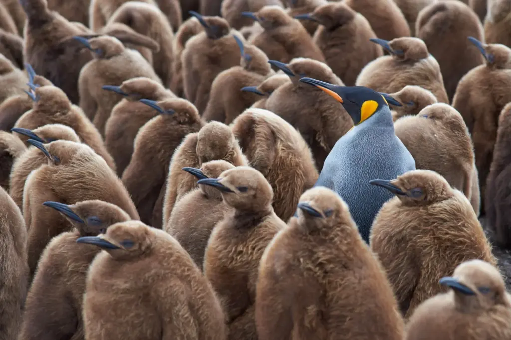
Animate vs Inanimate
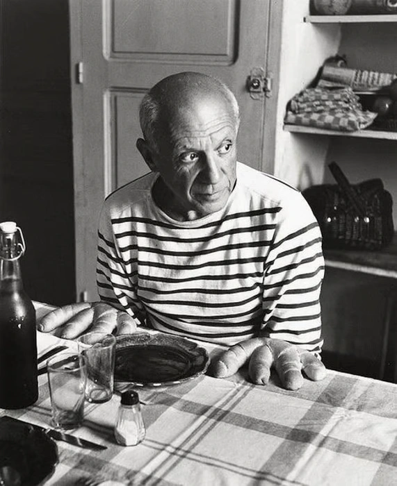
Yes, it is Picasso. The image shows him sitting at a table, but instead of hands, bread rolls appear in their place. What makes this photograph effective is its subtlety. At first glance, your attention naturally goes to his eyes and the direction of his gaze. The unusual detail is not immediately obvious.
This scene becomes a strong example of juxtaposition because it presents something unexpected. In the corner of your eye, you assume you are seeing hands. But when you look more carefully, you realize they are actually objects. The contrast between a living person and inanimate bread creates visual tension and surprise.
The comparison between animate and inanimate elements gives the image meaning. It challenges your expectations and makes you pause, which is exactly what powerful juxtaposition is meant to do.
Big vs Small
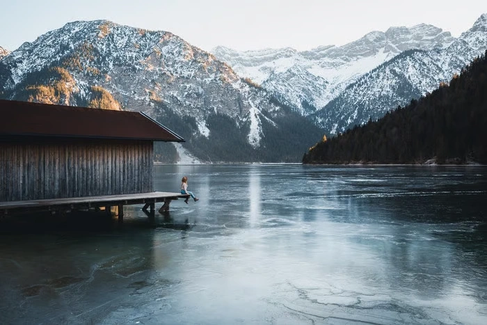
A basic way to use juxtaposition is by showing two conflicting ideas in a single image. One of the simplest methods is highlighting differences in size.
By placing something large next to something small, you create a clear visual contrast. This contrast becomes even stronger when the subjects have a meaningful relationship.
For example, a person standing in front of massive mountains looks tiny in comparison. This size difference emphasizes the grandeur of the mountains and adds a sense of scale, awe, and perspective to the photograph.
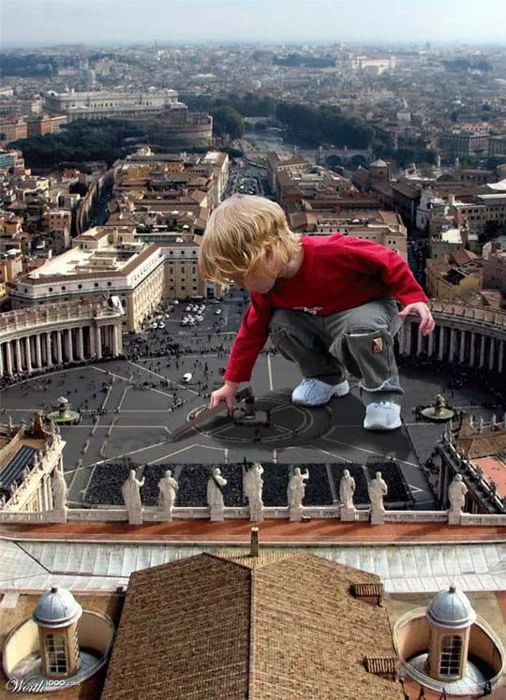
Big vs Small (Post-Editing)
Another way to emphasize size differences is through post-processing. With editing software, you can create striking contrasts that wouldn’t naturally occur in a single scene.
For example, a photo of a young boy can be superimposed onto an image of Rome. In this edited version, he appears as a giant, Godzilla-like figure looming over St. Peter’s Square. The contrast between his enormous size and the familiar surroundings creates a dramatic, playful, and visually engaging effect, showing how post-editing can expand the possibilities of juxtaposition in photography.
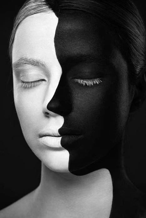
Black vs White
Color is a powerful way to create juxtaposition in photography, and few contrasts are as striking as black and white.
Black and white do more than just provide visual contrast—they carry meaning. Black can suggest mystery, depth, or seriousness, while white often represents purity, light, or simplicity. Placing these two together in a single frame creates both a strong visual impact and an emotional connection.
Using black and white contrast effectively can guide the viewer’s attention, highlight important elements, and give your image a bold, memorable look.
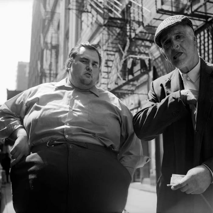
Another straightforward way to use juxtaposition is by highlighting differences in physical size, such as fat versus skinny subjects. This technique can also apply to objects, as long as you make them stand out in an otherwise busy scene.
The contrast between the larger and smaller forms immediately catches the viewer’s eye. In this type of image, the visual difference becomes the focus, making the juxtaposition clear and impactful. By emphasizing these differences, the photograph gains both interest and meaning.
Emotion vs Emotionless
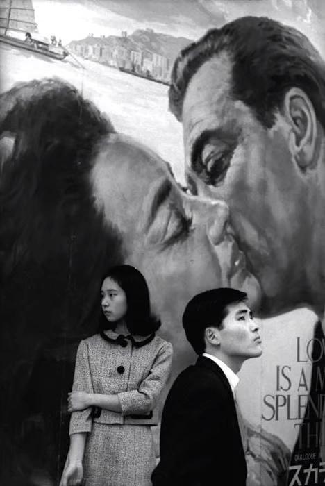
Photographers often play with the relationship between the foreground and background to create meaning. Juxtaposition can be achieved by contrasting emotional states in these layers.
For example, imagine a photograph where a couple on a billboard in the background is kissing passionately, full of emotion. In the foreground, another pair of people are facing away from each other, showing distance or indifference.
This contrast between emotion and emotionless behavior draws the viewer’s attention and adds depth to the story. By highlighting these opposing feelings in one frame, the image becomes more powerful and thought-provoking.
Healthy vs Harmful
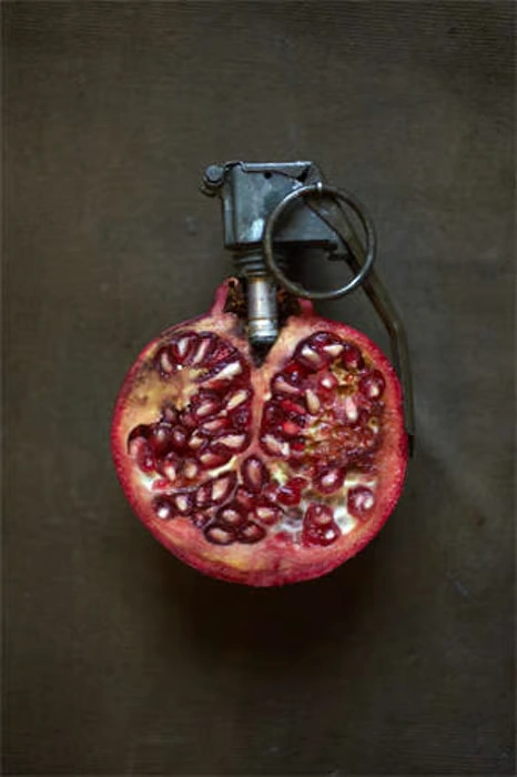
Photographers can use props to change how viewers perceive an object, creating striking juxtaposition. For example, a pomegranate can be transformed into a grenade. At first glance, both are similar in shape, but their meanings are completely different.
This contrast makes the viewer pause and think. The photographer might be referencing Greek mythology, where pomegranates are linked to Persephone and death, or they could simply be highlighting the difference between something healthy and something harmful. Either way, this clever use of visual similarity creates a powerful and thought-provoking image.
Human vs Machine
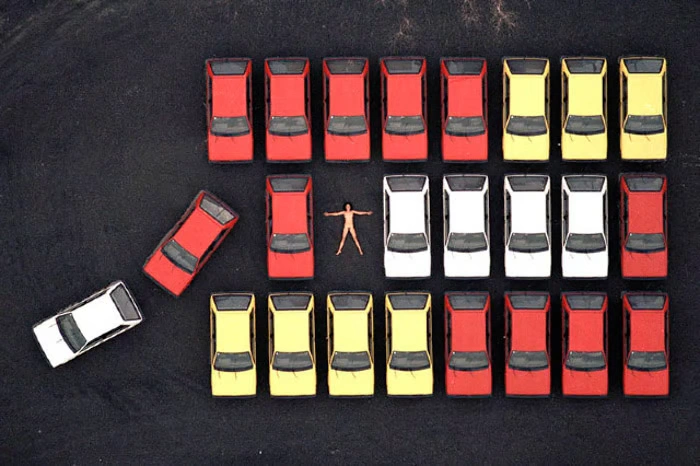
Juxtaposition can also explore surreal or unexpected contrasts. In this example, an aerial photograph uses repeating patterns to set up the scene.A gap in the pattern of cars immediately draws attention because we expect another vehicle to appear. Instead, a nude person is placed there, creating a striking contrast between the natural human form and the rigid, man-made environment.This type of juxtaposition highlights the difference between humans and machines, organic versus artificial, and adds a thought-provoking, almost surreal element to the image.
Lines vs Circles
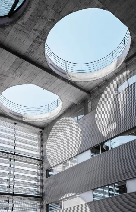
Shapes and forms are a powerful way to create visual interest and juxtaposition in photography. Lines and circles naturally contrast, making them perfect subjects for comparison.
In this example, the circles come from holes in the ceiling, while the straight lines appear as shadows cast across the walls. The combination of these two distinct shapes creates a strong visual contrast, guiding the viewer’s eye and adding depth to the image. By playing with geometric differences, photographers can make even a simple scene visually striking and engaging.
Growth vs Destruction
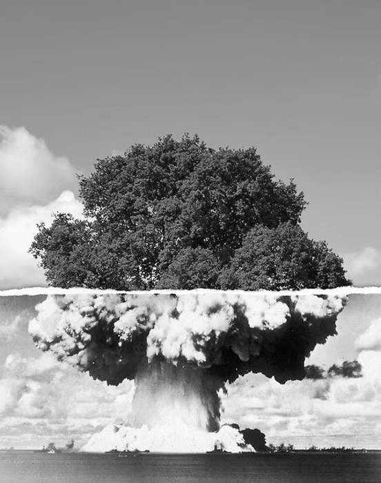
Juxtaposition doesn’t always have to be captured in a single moment—it can also be created during post-processing.
For example, a photograph of a tree can be merged with an image of an atomic bomb mushroom cloud. In this single frame, life and death coexist, showing growth alongside destruction. The contrast between the living tree and the deadly explosion creates a powerful, thought-provoking image. This type of juxtaposition highlights the extremes of existence and can leave a lasting impact on the viewer.
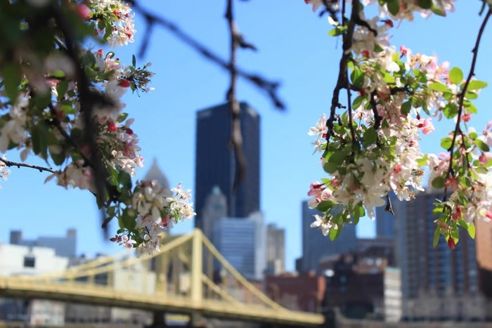
Natural vs Man-Made
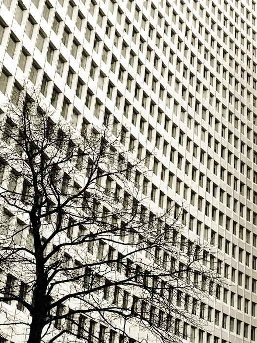
Our world is full of natural and man-made elements, and juxtaposing them in photography can create visually striking images.
For example, a photo may feature a man-made structure with precise, straight lines and perfectly repeated rectangles, placed next to a tree with irregular, bumpy curves. The contrast between the uniformity of the building and the organic uniqueness of the tree draws the viewer’s attention.
This type of juxtaposition not only highlights visual differences but also emphasizes ideas like repetition versus individuality, order versus chaos, and the interaction between nature and human design.
New Technology vs Old Technology
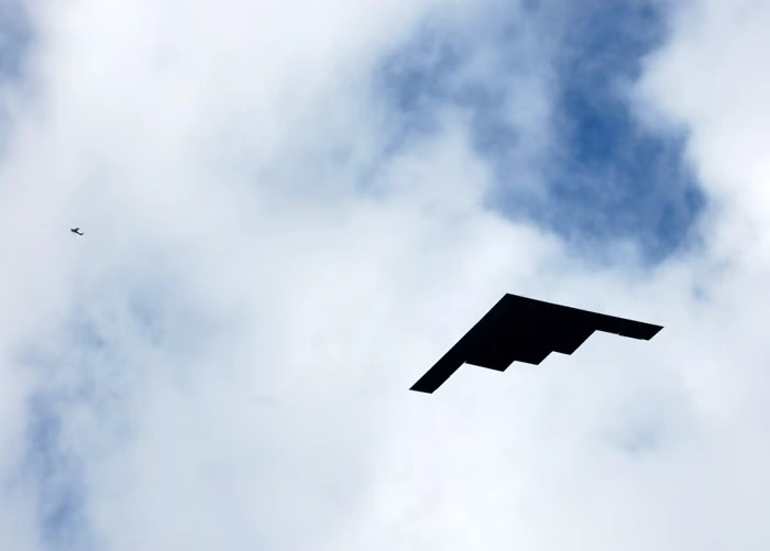
Technology provides a strong opportunity for juxtaposition in photography. With rapid innovation, new devices quickly replace older mechanical objects, creating clear contrasts.
By showing old technology alongside modern gadgets, a photographer can highlight how much progress has been made. This comparison tells a story about society, change, and the pace of innovation. The image becomes more than just a picture—it reflects cultural evolution and invites viewers to consider the impact of technology on daily life.
New vs Old Architecture
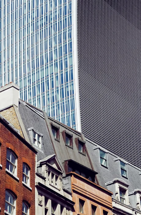
Architecture naturally lends itself to juxtaposition, as buildings reveal the history and culture of a place.
In this example, older architectural styles appear in the foreground, full of character and detail, while a massive modern skyscraper towers in the background. The contrast emphasizes how new construction can overshadow older structures, showing the shift from traditional to contemporary design. This kind of juxtaposition not only highlights visual differences but also tells a story about progress, change, and the passage of time.
Young vs Old
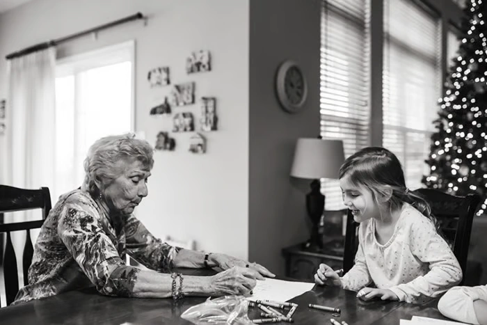
Few juxtapositions are as emotionally powerful as images of the young and the old. These photographs capture the passage of time, showing how knowledge, culture, and traditions are passed from one generation to the next.
The contrast between youth and age reminds viewers of life’s fleeting nature. By placing young and old subjects together in a frame, photographers can create images that feel deeply human, nostalgic, and meaningful—encouraging reflection on growth, experience, and the inevitability of time.
Start Your Free Trial — Get 3 Images Edited FREE!
Ready to see the real power of professional photo editing? Now is the perfect time to experience the difference with Cutout Partner’s Free Photo Editing Trial. Whether you’re a photographer, eCommerce seller, studio manager, or marketing agency, high-quality images can dramatically improve customer trust, engagement, and sales.
Start Your Free Trial — Get 3 Images Edited FREE!
Patterns and Colors
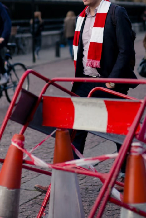
Using patterns and colors is a simple yet striking way to create juxtaposition in photography.
For example, a photographer might capture a scarf worn by a subject that closely resembles the colors and patterns of roadwork barriers and tape in the environment. While the colors and patterns are similar, the juxtaposition comes from their different contexts—one is clothing, the other is part of a construction site.
Street photography often offers many opportunities like this, where everyday objects interact in unexpected ways, creating visual contrasts that catch the viewer’s eye and make the scene more interesting.
People vs Warfare
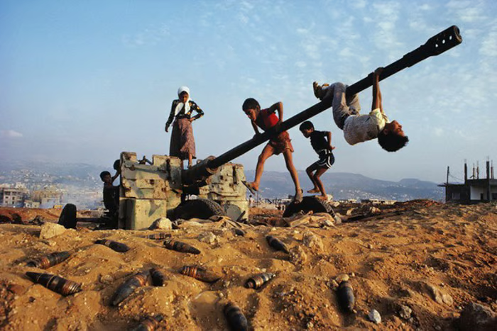
Documentary photographers often use juxtaposition to tell powerful stories by placing humans in unexpected or contrasting environments.
For example, children playing around an old, abandoned artillery weapon create a striking contrast. An object once associated with death and destruction is now part of play, laughter, and joy.
This type of juxtaposition highlights resilience and the ability of life to continue even in the shadows of conflict. It also forces viewers to reflect on the contrast between innocence and the harsh realities of warfare, making the image both thought-provoking and emotionally impactful.
People vs Perception
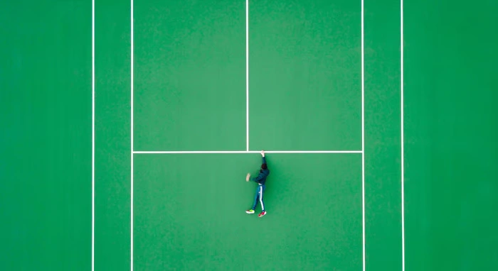
This type of juxtaposition plays with the viewer’s expectations, creating surprise and curiosity.
In one striking example, a photograph taken from above shows a man seemingly clinging to a ledge for his life. At first, it looks tense and dangerous. But after a few moments, you realize the background is actually a tennis court—the scene isn’t threatening at all.
Here, the setting is cleverly repurposed, changing how we perceive the situation. The contrast between what we initially think and the reality makes the image memorable, playful, and thought-provoking, showing how perspective itself can be used as a tool for juxtaposition.
Wealth vs Poverty
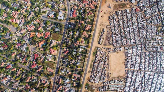
Many photographers explore the contrast between wealth and poverty, using their work as a form of social commentary. This type of juxtaposition is powerful because it highlights issues that are universally understood and relevant across the world.
In one example, aerial photography captures this contrast clearly. On one side, densely packed buildings show crowded, urban living conditions, while on the other side, a sparser, greener area represents wealth and space. The visual difference immediately communicates inequality and encourages viewers to reflect on social and economic disparities.
Poverty vs Idealism
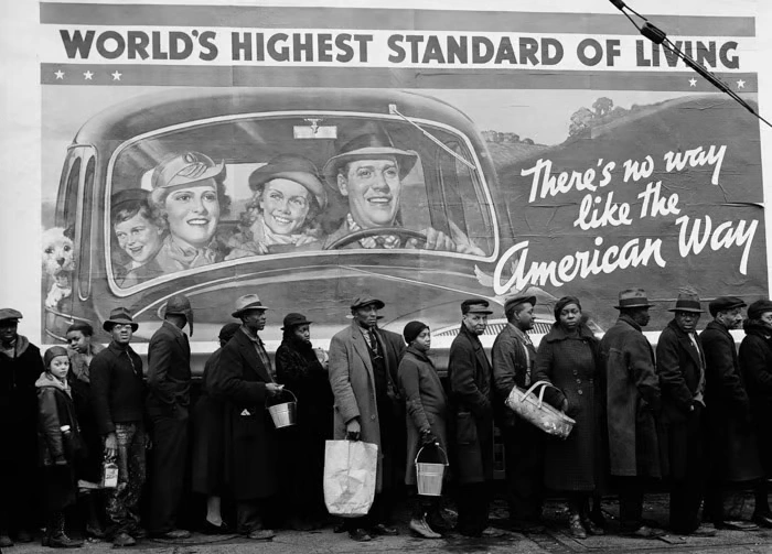
Billboards are a great way to show the state of the country the image was taken in. They serve as backdrops to products, services, and public announcements.
Here, the billboard proudly states that this country has the “world’s highest standard of living.” And in the foreground, one sees many people queuing for food. Otherwise known as a breadline.
And the happy people in the background are all white, whereas the entire breadline is made up of people of color. This screams volumes.
Repurposing Juxtapositions
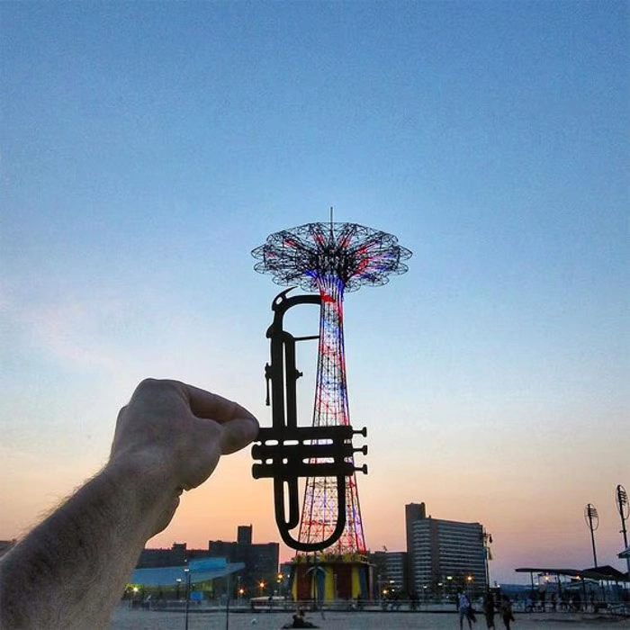
This image is amazing. The photographer extends his arm and places a cutout version of a trumpet in front of the lens while photographing.
He repurposes the object in front of him into something different. While he is showing us how he did it. We see both objects separately, but also together, creating a new and third object.
Role Replacement Juxtaposition
Juxtaposition doesn’t always come from what’s physically in the frame—it can also come from the concept or story behind the image.
For example, a photograph shows a little girl peeling carrots, preparing food as if she were the mother. In the background, a younger sibling waits, highlighting the role she has temporarily assumed.
This type of juxtaposition draws attention to the contrast between the girl’s age and the adult-like responsibility she is taking on. By telling a story through roles and actions, the image becomes meaningful and emotionally engaging.
We naturally expect an adult to be doing that task. When a young girl steps into that role, the image takes on a deeper meaning.
This unexpected role reversal makes viewers pause and think. It highlights responsibility, maturity, and the contrast between age and action, allowing the photograph to tell a more powerful and thought-provoking story.
Straight vs Curved
Lines are a simple but powerful way to create juxtaposition in photography. In this example, a straight, taut line is placed alongside the natural curve of flowing water, creating a clear visual contrast.
The contrast is enhanced by color and tone. The black straight line rests on a lighter background, while the white curve of the water appears in a darker area. This combination of shape, color, and atmosphere makes the image visually striking, showing how simple elements like lines can create depth and interest through juxtaposition.
Power vs Weakness
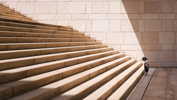
Images with a single subject can create a strong sense of scale and highlight contrasts in a scene. In this example, a little boy stands before a large set of steps. Without him, we might not fully understand the size or magnitude of the steps.
The boy gazes at the first step, while many more tower ahead. The strong, prominent lines of the steps contrast sharply with his small frame, creating a powerful juxtaposition between strength and vulnerability. The image captures a moment of challenge, emphasizing how something can feel overwhelming when faced with size or power—but also hinting at growth and potential.
Vintage vs Modern
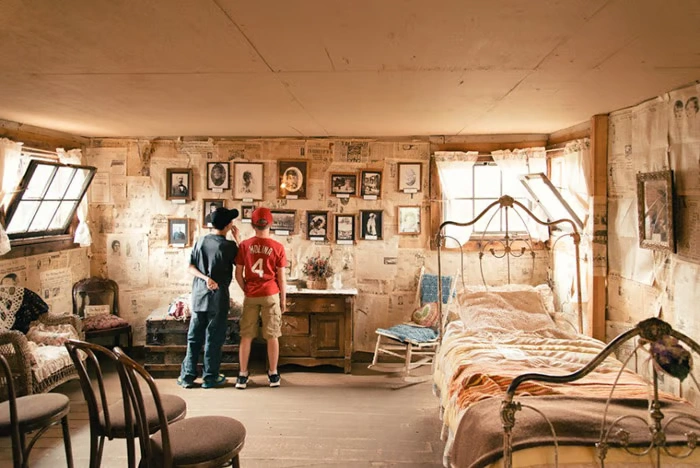
Vintage objects and scenes have a timeless appeal, seen everywhere in fashion, art, architecture, and music. They help teach younger generations about the past through objects, styles, colors, and patterns.
In this example, two boys dressed in modern clothes explore a vintage room. The furniture and atmosphere are clearly from another era, and without the boys, the scene would feel completely timeless. Their presence creates a striking juxtaposition between the old and the new, highlighting how modern life interacts with history and giving the image both context and story.
Past vs Present
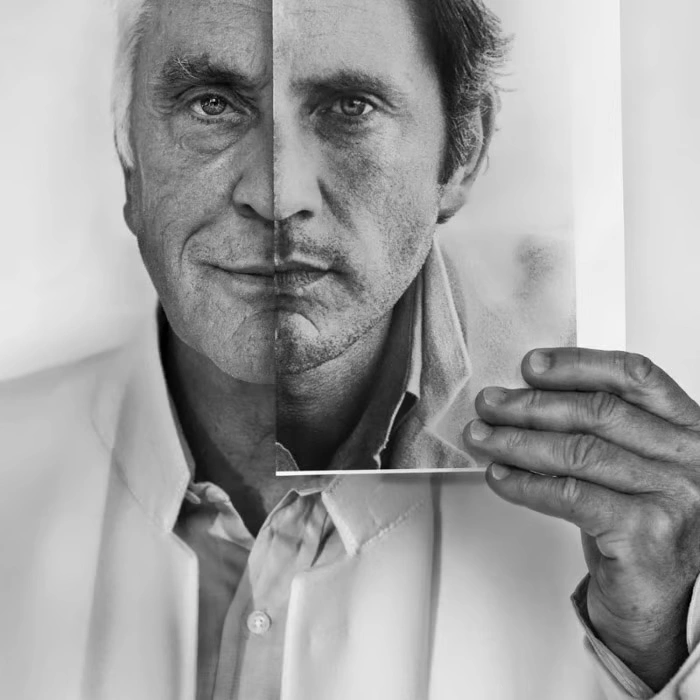
This powerful example of juxtaposition shows Terence Stamp, a renowned actor, in two different stages of life. On the left, we see a modern portrait of him, while on the right, a younger version of him appears.
By using the older image to partly obscure and partly reveal his current face, the photograph allows viewers to compare the two halves. We notice how time has changed him, seeing the effects of life and aging. This contrast between past and present creates a striking visual story about growth, experience, and the passage of time.
Expected vs Actual Size
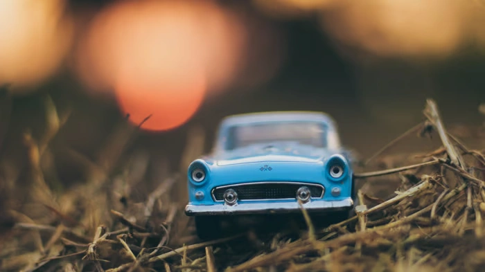
This example of juxtaposition plays with expectations. At first glance, the object appears to be a life-sized car, but a closer look reveals that it’s actually tiny, placed among twigs.
The contrast between what we expect and the reality creates surprise and interest. The shallow depth of field enhances the effect by making the miniature car appear more realistic at first, drawing the viewer in before the true scale becomes clear. This technique shows how perspective and context can be used to create striking visual contrasts in photography.
Stereotypes and Juxtapositions
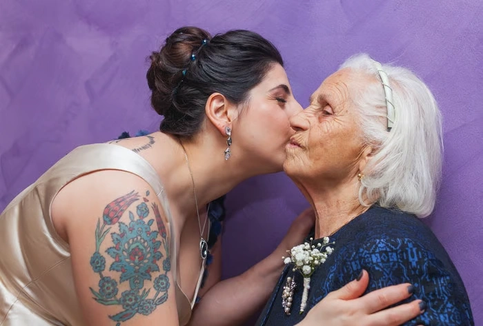
Every culture and community around the world relies on stereotypes—assumptions about gender, appearance, ethnicity, or traditions. While these generalizations are often oversimplified, they shape the way we perceive people at first glance.
In this image, the woman on the left has tattoos, which some older generations might view as rebellious or unconventional. Yet, she is elegantly dressed and warmly embracing her grandmother. This juxtaposition challenges traditional stereotypes, showing that outward appearances don’t define personality, behavior, or values.
Such contrasts can provoke thought and engage viewers, encouraging them to question assumptions and appreciate the complexity of human identity.
Handmade Craft vs High-Tech Store
Placing a handmade craft in a high-tech store creates a striking juxtaposition between tradition and modernity. The delicate, personal nature of the craft contrasts sharply with the sleek, mass-produced technology surrounding it.
This contrast draws the viewer’s eye and highlights the differences in texture, style, and purpose. It emphasizes the human touch in a world dominated by machines, making the image visually interesting while telling a story about old versus new, personal versus impersonal, and craftsmanship versus technology.
Musician vs Silent Library
A musician performing in a quiet library courtyard creates a striking juxtaposition between sound and silence. The lively presence of music contrasts sharply with the expected calm and stillness of the library setting.
This contrast draws attention to both the performer and the environment, making the scene feel unexpected and memorable. It emphasizes the clash between activity and tranquility, showing how placing subjects in unusual contexts can create visually and conceptually engaging photographs.
Crowded Subway vs Peaceful Countryside
Placing a crowded subway train in the middle of a quiet countryside creates a powerful juxtaposition. The hustle and bustle of the packed train sharply contrasts with the calm, open, and serene natural surroundings.
This contrast draws the viewer’s attention and highlights the difference between urban life and rural tranquility. It emphasizes the tension between human activity and nature, showing how juxtaposition can turn an ordinary scene into a thought-provoking and visually striking image.
Conclusion
We hope these examples of juxtaposition have helped you understand this powerful compositional tool. With this knowledge, you’ll be able to spot contrasts and juxtapositions in the world around you and use them to make your photographs more engaging.
You don’t need to avoid clichés at first—start with any examples of juxtaposition you notice. After a few photoshoots with this concept in mind, you’ll begin to discover unique and creative juxtapositions that will give your photography depth, meaning, and visual impact.
1. What is juxtaposition in photography?
Juxtaposition is a compositional technique where two or more elements in a scene are placed together to highlight their differences or contrasts. It can create visual interest, tell a story, or evoke emotion.
2. Why should I use juxtaposition in my photos?
Using juxtaposition adds depth and meaning to your images. It helps viewers compare, contrast, and interpret the story or message behind your photograph, making it more memorable and engaging.
3. What are some classic juxtaposition examples?
- Big vs Small: A person in front of massive mountains
- Past vs Present: Young vs old version of the same person
- Natural vs Man-Made: Trees next to a skyscraper
- Emotion vs Emotionless: Smiling couple on a billboard with indifferent people in the foreground
4. Can juxtaposition be created in post-processing?
Yes! You can combine images or manipulate elements to create striking contrasts, such as a child appearing as a giant in a cityscape, or a tree placed alongside an atomic bomb cloud to show growth vs destruction.
5. How does color play a role in juxtaposition?
Colors create visual contrasts that can enhance juxtaposition. For example, black vs white, or a brightly colored object against a muted background, immediately draws attention and emphasizes differences.
6. Can juxtaposition include concepts or ideas, not just objects?
Absolutely. Juxtaposition can be conceptual, like showing a child taking on an adult’s role, or depicting human vs machine. The idea is to contrast roles, ideas, or emotions to tell a story
7. Are there subtle forms of juxtaposition?
Yes, subtle juxtapositions are often the most effective. They can be small contrasts that the viewer notices gradually, such as a patterned scarf matching road barriers or a tiny toy car in a natural setting.
8. What are some fun or creative examples for inspiration?
- A musician performing in a silent library
- A handmade craft displayed in a high-tech store
- A crowded subway passing through a calm countryside
- A young boy superimposed over a cityscape to look gigantic
9. Can juxtaposition be emotional?
Definitely. Juxtaposition can evoke strong emotions, like showing young vs old, joy vs sadness, or wealth vs poverty. The contrast makes the viewer reflect and connect on a deeper level.
10. How do I start finding juxtaposition in my photography?
- Observe your surroundings and notice contrasts in size, color, form, or emotion.
- Don’t worry about clichés at first—any clear contrast works.
- Experiment with foreground vs background, old vs new, or natural vs man-made elements.
11. What mistakes should I avoid when using juxtaposition?
- Forced juxtaposition that feels unnatural
- Overcrowding the frame with too many contrasting elements
- Ignoring context, which may confuse the viewer
- Neglecting composition, lighting, or focus, which can weaken the effect
12. Can street photography benefit from juxtaposition?
Yes! Street photography is full of unexpected juxtapositions—like patterns, colors, human interactions, or urban vs natural elements—that tell stories about everyday life.