You may well have seen the “Rule of Thirds” plenty of times at work in a photograph or image on a website and not even realized it; it’s well-known (and well-applied!) photography technique that’s been making pictures more captivating for a long time—including making websites have more harmonious layouts—and has much to offer designers, as you’ll find.
What Is the Rule of Thirds?
The rule of thirds works in the same kind of visual magic zone as the Golden Ratio—and while capitalization doesn’t really matter, it’s helpful to introduce these terms once to show how powerful they are. This technique is all about composition, helping artists, photographers, UX designers, and UI designers create visuals that are not only beautiful but also connect with people on a deeper, emotional level.
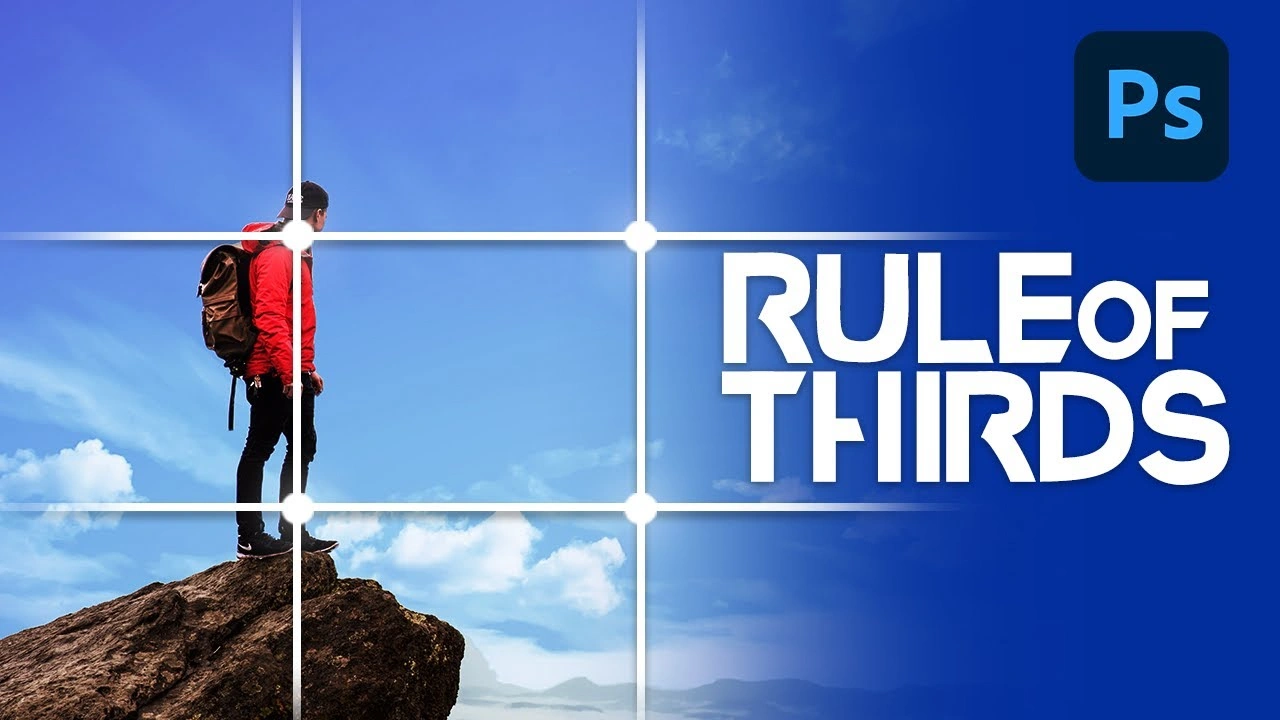
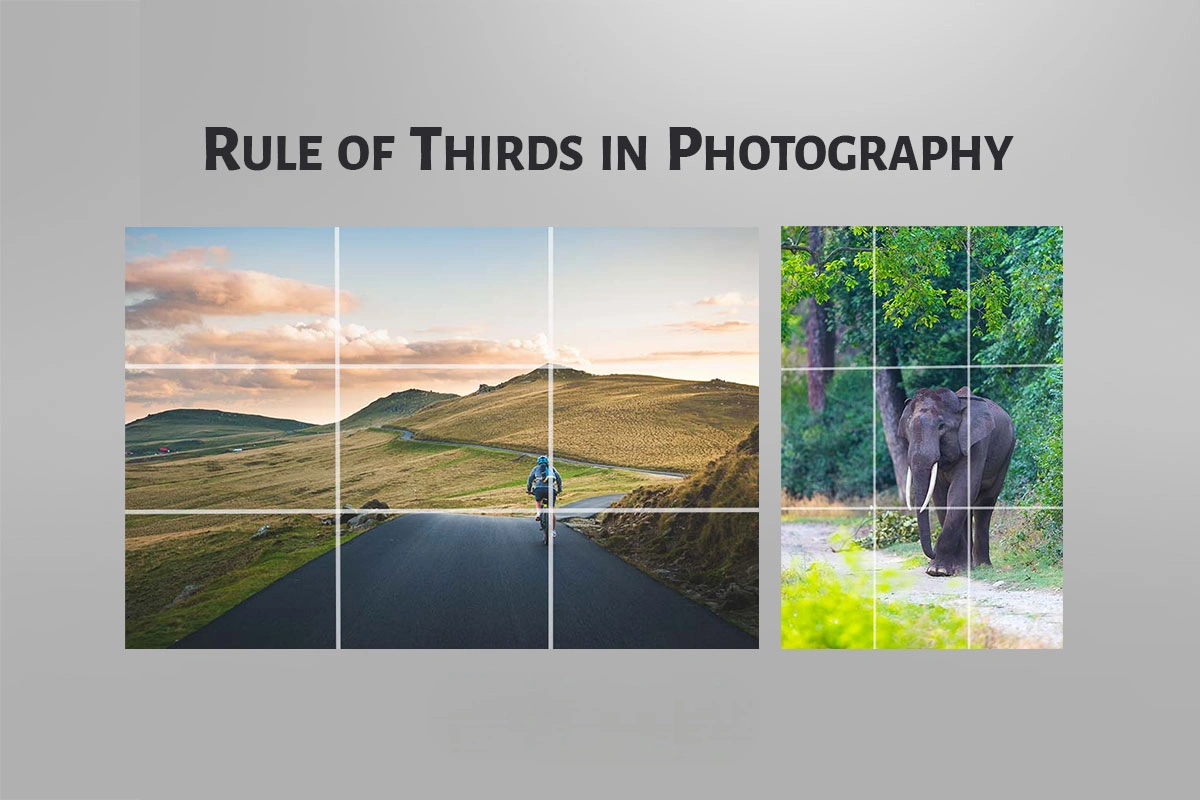
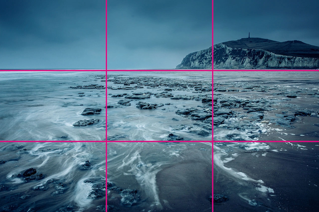
Imagine splitting an image into nine equal parts using two vertical and two horizontal lines, creating a grid with three rows and three columns. The idea is to place your main subject along these lines or at their intersections, leaving space for other elements. While there are other composition methods, the rule of thirds helps you take well-balanced shots that communicate more to viewers and make your images more engaging.
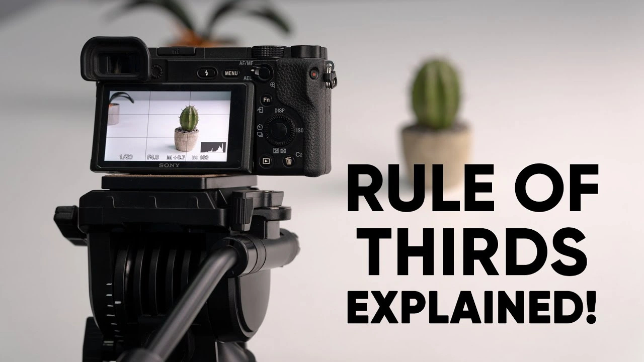
The best part is that most cameras and smartphones have a built-in rule-of-thirds setting. This makes it easy to balance your main subject with the white space in your image. That white space—or negative space—creates a calm area that highlights what’s happening in your photo or design.
The rule of thirds is a powerful tool that can greatly improve your images, and the only way to master it is through practice. The more you experiment, the sharper your eye becomes—and it’s fun to see what works.
“If you are tuned in to the imagery we see around us, I feel like you sort of absorb [the rule of thirds] even if you can’t put your finger on it.”
— Khara Plicanic, Photographer, Author, and Instructor
What Is the Rule of Thirds Photography
The rule of thirds has been a useful design tool in graphic and UI design for decades. It helps designers align and position elements to create balance, add visual interest, and guide how viewers perceive content in visually appealing layouts.
The technique works by dividing a page into a three-by-three grid, like a tic-tac-toe board, creating nine equal sections. The four points where the lines intersect are considered the “sweet spots” of a design—natural areas where people’s eyes tend to focus first—making them ideal for placing key elements.
Just like in graphic design, the rule of thirds is a key principle in UI (user interface) design. It helps structure and organize screen elements, making layouts more balanced, interesting, and visually engaging. Placing main subjects—like text, images, icons, or buttons—along the lines or intersections can make your design more dynamic.
The four intersection points are usually ideal spots for important elements. For example, a website template from Wix positions key items like the hero image, titles, or CTAs (calls to action) along the horizontal grid lines. This technique works well, but keep in mind that UIs are responsive. Not every intersection works perfectly on all screen sizes. The rule of thirds is meant to guide your design, helping you create layouts that are both visually appealing and effective.
How to Use the Rule of Thirds for Images (Expert Level Explained!)
Once you understand the rule of thirds, it becomes much easier to apply, and with practice, you’ll see how it helps you capture better results. There are four essential guidelines to keep in mind—tactics that can improve the visual appeal of your photos. By following them, you can enhance not only the images used on websites and UI layouts but also the overall quality of your digital content.
1. Align the Subject With Lines or Intersections
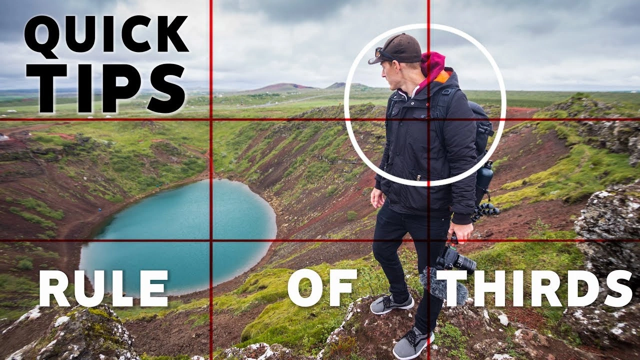
Before taking a photo, enable the 3×3 grid on your camera or smartphone screen. Focus on the four intersections where the lines cross, and position your subject there—or along the vertical or horizontal lines.
For example, in an image with a human figure as the focal point, placing the subject along the right line keeps the focus on them while allowing other visual elements to complement the scene and add context
2. Align the Linear Elements With Grid Lines with Photography
You can also align elements with the vertical or horizontal lines of the grid, depending on the subject. Programs like Lightroom (including its mobile app) make this easy. The orientation of your objects or scene determines which line works best.
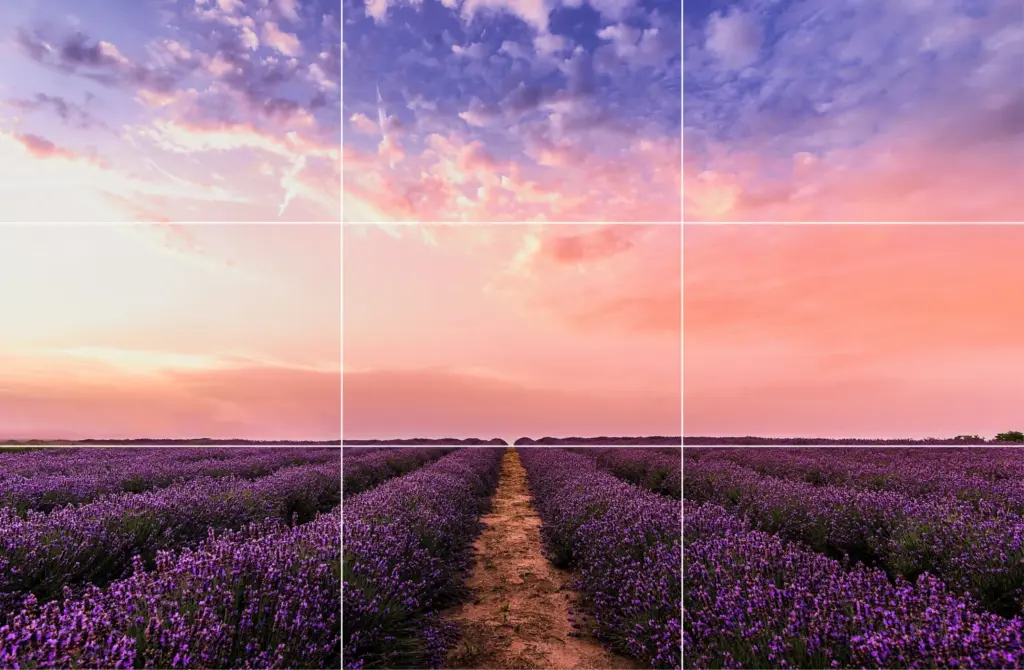
For example, landscapes—such as horizons, forests, beaches, or cityscapes—look best when aligned with horizontal grid lines. On the other hand, vertical subjects like doors, pillars, waterfalls, or standing people are more visually pleasing when aligned with vertical lines.
The bonus of the rule of thirds is that while you create a balanced, attractive composition, you also emphasize interesting elements in the scene. Even if there’s no obvious story, viewers can often imagine one, giving your photos more depth and visual impact.
3. Align Objects Diagonally
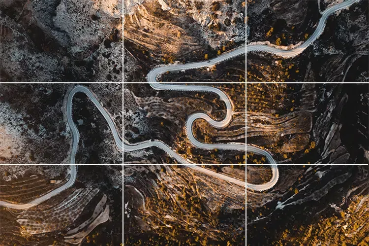
While the rule of thirds often focuses on vertical and horizontal lines, aligning elements diagonally can create dynamic and engaging compositions. This technique works especially well for objects with irregular or winding shapes, like paths, roads, or rivers.
Place the main subject along a diagonal, using the diagonal intersection points to guide placement. This encourages viewers’ eyes to move naturally across the image, creating a more immersive and visually striking effect.
4. Break the Rule of Thirds
Yes, you read that right! Sometimes, breaking the rule of thirds can work better than following it—think of Picasso’s advice: learn the rules like a pro, so you can break them like an artist.
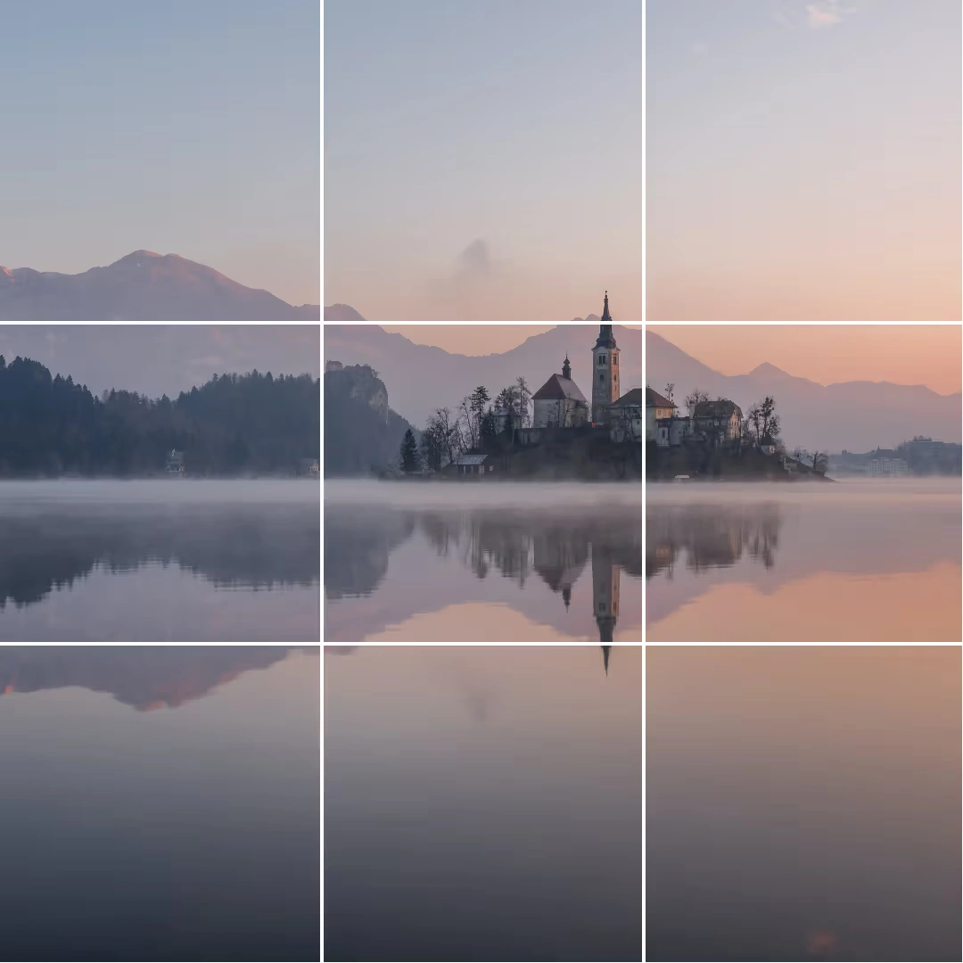
This approach works in rare cases, such as when the scene already has natural balance or symmetry. Landscapes with lake or river reflections, seas, or wet roads often display this kind of harmony, meaning the rule of thirds isn’t always necessary. Knowing when to bend or skip the rule can make your photos even more creative and visually appealing.
So, while “breaking the rule” works in certain cases, there are other situations in photography and design where the rule of thirds may not apply at all. In these cases, it’s okay to set the rule aside and focus on what best serves the image or design.
1. Small Subject
When the subject of your photo is very small—like a distant building, bird, or insect—the rule of thirds may not be helpful. In these cases, it’s better to place the subject in the center of the frame to make it clearly visible.
2. Frame-Filling Portraits
If your subject fills most of the frame, such as in close-up portraits, applying the rule of thirds can be tricky or unnecessary. Since the subject already dominates the image, placing them in the center works best and draws immediate focus.
Rule of Thirds Example 1
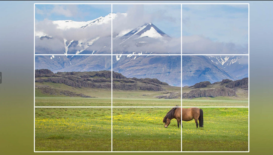
A photo of a bare tree in a snowy field demonstrates the rule of thirds perfectly. The tree, the main subject, is aligned along the left vertical line, while the horizon follows the lower horizontal line.
This placement leaves negative space on the right, setting the scene without distractions. The foreground takes up one-third of the image, and the background fills two-thirds, adding depth. By not centering the tree, the composition feels balanced and allows viewers to imagine a story within the wintry landscape.
This example is somewhat similar to the previous one but highlights three key points. First, the horizon isn’t clearly visible—or might be absent altogether. Second, the rule of thirds is followed loosely, with only the main subject (a windmill) positioned along the left side using the intersections. Finally, the photographer aligns the limited horizon with the bottom horizontal grid line to maintain balance and proper proportions.
Example 3
A snake boat sails against a sunset with palm trees in the background.
In this photo, the rule of thirds is used loosely—almost to the point of breaking it—but there’s still much to learn. The photographer divides the image horizontally into two near-equal halves by placing the coastline in the center. The main subject, the boat, is also nearly centered, which works because it’s small and leaves space for important details. The composition naturally splits into three parts: the river in the foreground, the boat and horizon as the central elements, and the trees and sun in the background.
This example is quite rare, as perfect symmetry in objects or landscapes isn’t common, but it offers valuable lessons. The main subject—the mosque’s façade—fills most of the frame, yet its placement is nearly perfectly aligned with the grid. The spacing around the subject is almost equal on both sides, creating a balanced composition.
Centering the subject allows space for important details like the sky and the patterned floor. The photo naturally divides into three parts: the floor in the foreground, the mosque façade as the central element, and the sky in the background.
Example 4
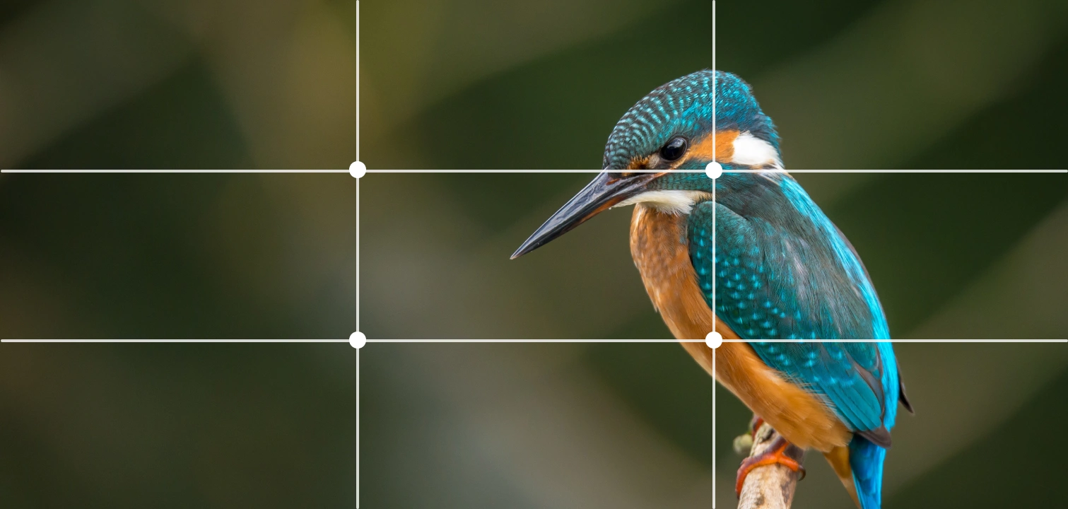
Finally, portraits and people are often easier to compose using the rule of thirds than landscapes. In the portrait above, the photographer keeps the subject centered and focused. A key tip is to place the eyes along the upper horizontal grid line, while the shoulders remain within the lower section.
By aligning the face with the center and following these grid lines, the rule of thirds creates a balanced and visually appealing portrait.
Learn more about grid systems in How To Use Grid Systems.
Best Tools for Editing Using the Rule of Thirds
If you don’t apply the rule of thirds while taking a photo, you can still improve the composition during editing. Most photo editing software includes grid options to help you align subjects and elements. Here’s how to use the rule of thirds in different programs:
1. Adobe Photoshop
You can use the rule of thirds in Photoshop in two ways:
Way 1:
- Open your photo in Photoshop.
- Click the crop tool in the top toolbar.
- Look for the grid icon in the top bar and select Rule of Thirds.
- Check Always Show Overlay to keep the grid visible while cropping.
Way 2:
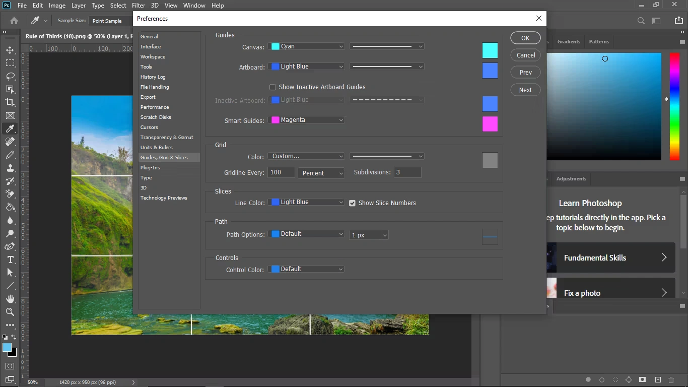
- Go to Edit > Preferences > Guides, Grids & Slices.
- Set Gridline Every to 100, then choose Percent.
- Set Subdivisions to 3 and click OK.
- If the grid doesn’t appear, go to View > Show > Grid to enable it.
This allows you to adjust your photo composition precisely using the rule of thirds.
2. Lightroom
Lightroom, including its mobile app, is a popular choice for photo editing. To use the rule of thirds:
- Import your photo into Lightroom.
- Go to the Develop module and click Crop Overlay.
- Navigate to Tool > Crop Guide Overlay > Thirds to enable the three-by-three grid.
3. GIMP
To use the rule of thirds in GIMP:
- Go to View > Show Grid to enable the default grid (lines appear 10 pixels apart).
- To customize, go to Image > Configure Grid.
- Divide the width and height by 3 to set proper spacing.
- Adjust the line style, color, and spacing to your preference.
4. Canva
Canva is widely used for graphic design and photo editing. The rule of thirds grid is available for Canva Pro users. To enable it:
- Create a custom-sized artboard for your image.
- Upload your photo and place it on the artboard.
- Click Files in the top-left corner and select View Settings.
- In View Settings, choose Add Guides.
- Go to Custom and set 3 rows and 3 columns to create a rule of thirds grid on your artboard.
This allows you to align elements precisely and improve your composition using the rule of thirds.
You might also read this article
- From Click to Wow: 30 Essential Photography Tips for Beginners
- Product Photography Pricing Guide – How Much Should You Charge
The Takeaway
The rule of thirds is a powerful, time-tested visual design principle. By dividing your image into a 3×3 grid and aligning subjects along the lines or intersections—the “sweet spots”—you can create more balanced, engaging, and visually appealing compositions. Most cameras and smartphones even include this grid as a preset, making it easy to apply.
When used effectively, the rule of thirds helps images communicate more to viewers—including users on your website—and adds depth and focus to your visuals. With the examples provided, guidance on when to follow or break the rule, and tips for using editing software like Photoshop, Lightroom, GIMP, and Canva, you now have a toolkit to apply this principle across photography and UI design.
For deeper insights, consider courses on visual perception from the IxDF, covering topics like the anatomy of the eye, human color vision, and other essential design principles. These lessons can take your photography and UI skills to the next level while broadening your creative toolkit.
Rule of Thirds in Photography: Frequently Asked Questions
-
What is the rule of thirds in photography?
The rule of thirds is a composition technique where an image is divided into a 3×3 grid with two vertical and two horizontal lines. Key subjects or elements are placed along these lines or at their intersections, creating a balanced, visually appealing image.
-
Why is the rule of thirds important?
It helps photographers create images that feel natural, balanced, and engaging. Using it can improve storytelling, guide viewers’ eyes, and highlight the main subject while leaving space for context or background.
-
Can the rule of thirds be applied to portraits?
Yes! In portrait photography, placing the subject’s eyes along the top horizontal line and keeping the face near one of the vertical intersections often produces the most pleasing results.
-
Does the rule of thirds work for landscapes?
Absolutely. For landscapes, the horizon is typically aligned with either the top or bottom horizontal line, and other elements—like trees, mountains, or buildings—are placed along vertical lines or intersections.
-
Can I break the rule of thirds?
Yes. Breaking the rule is sometimes better, especially when the image already has natural balance or symmetry. Centered subjects, reflections, or certain creative compositions may work more effectively without following the grid.
-
How can I use the rule of thirds on my camera or smartphone?
Most cameras and smartphones have a built-in grid option. Enable the 3×3 grid in your camera settings to position your subject along the lines or intersections while shooting.
-
Can I apply the rule of thirds during photo editing?
Yes. Editing software like Adobe Photoshop, Lightroom, GIMP, and Canva allows you to overlay a 3×3 grid, crop, and adjust the image so the subject aligns with the rule of thirds.
-
Is the rule of thirds used in UI and graphic design?
Definitely. Designers use it to align visual elements, create balance, and guide viewers’ attention in web and app layouts. Intersection points often become ideal spots for key content like buttons, images, or CTAs. - What are common mistakes when using the rule of thirds?
- Placing subjects too far off-grid or ignoring the context of the scene.
- Overusing the intersections, making the composition feel forced.
- Forgetting about negative space, which adds depth and visual calm.
-
How can I practice the rule of thirds effectively?
Experiment with different subjects, perspectives, and compositions. Use grids on your camera or editing software, study professional photos, and observe how the rule naturally appears in everyday scenes. With practice, applying it becomes intuitive.